
Spencer Lowell
Brand Identity
Mar 2022
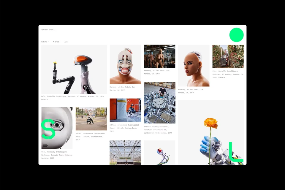
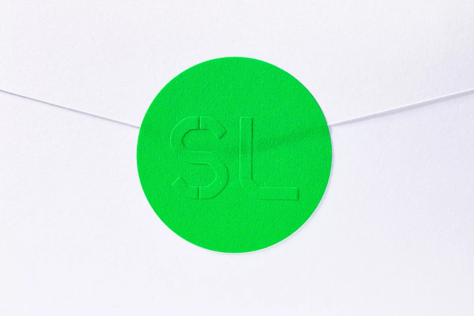
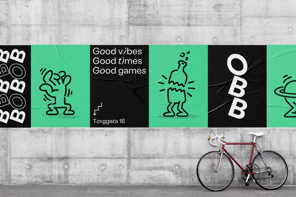
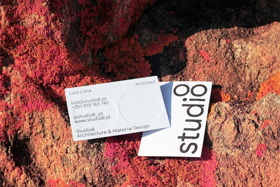
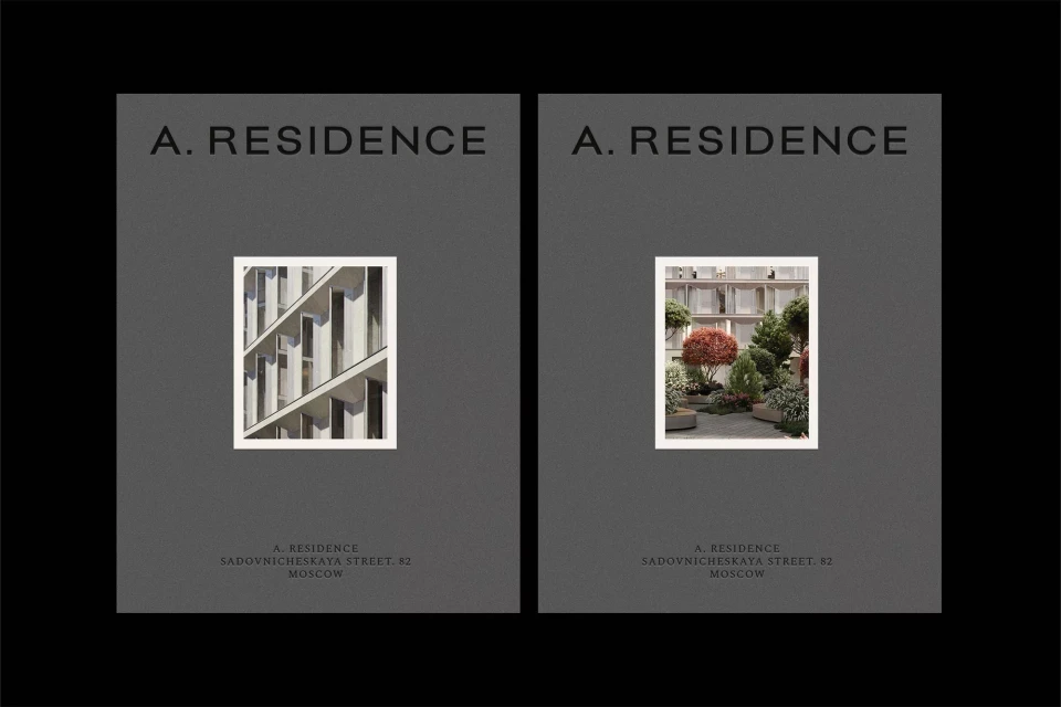
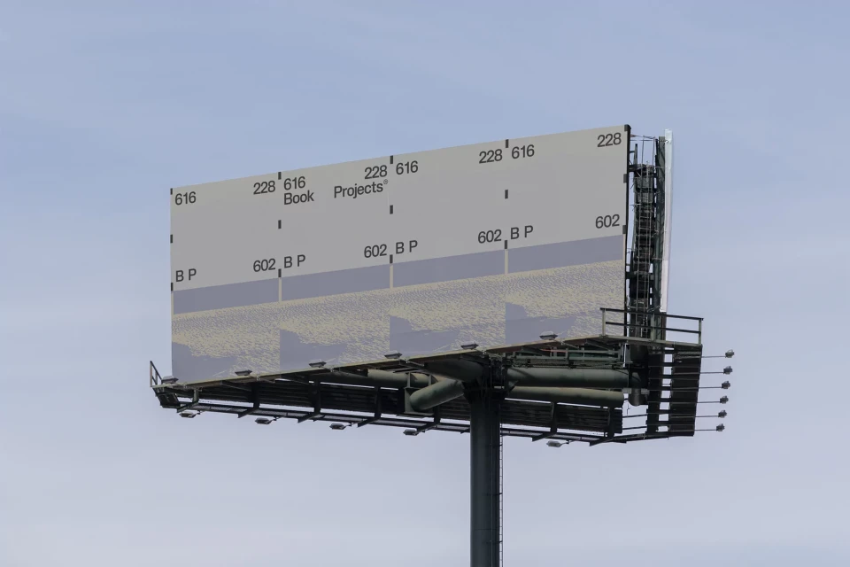
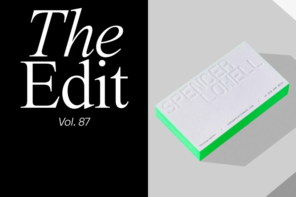
Spencer Lowell’s brand identity project centers on a refined, minimalist aesthetic tailored for commercial and corporate applications. The visual system integrates clean, sans-serif typography with a high-contrast palette of monochrome tones and signature fluorescent green accents. The design demonstrates a consistent structural language, employing geometric alignments and precise content hierarchies across digital interfaces, print collateral, and large-scale outdoor media. Technical executions such as embossing and debossing feature prominently across stationery, emphasizing a tactile engagement with materials like textured paper stocks. The identity effectively bridges the gap between high-end technical photography and structured graphic design, utilizing stark, minimalist layouts to frame portfolio content and architectural references. The project was developed through a collaborative effort featuring work by Lundqvist & Dallyn, Yucca Studio, Mecha Studio, MADE IN BURO, Duties, and Plus Mûrs.
Horizontal, Commercial, Clean, Minimalist
Typography


