
Souper Duper: Brand Identity



Brand
Date
Feb 2023
Description
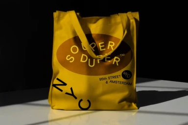
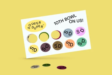
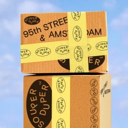
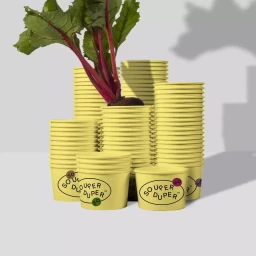
Souper Duper establishes its visual identity through a cohesive range of CPG and food packaging materials. The design system centers on a distinct oval logo, rendered in bold typography across stationery, compostable packaging, and environmental signage. Brooklyn Design Services executed the graphic design, balancing a high-contrast aesthetic with natural light product photography. The project leans into a vibrant yellow and neutral palette, emphasizing clean composition and minimal vector elements to create a unified brand experience across both physical assets and loyalty programs.
Style
Horizontal, Commercial, Clean
Industries
Color
Golden Yellow
Context
E-commerce / Product
Associated creatives

5000+ creatives to discover
Sign up to gain access to the entire directory. It’s free.
Visie is a curated library of creative professionals.