SOMA: Brand Identity


Oct 2021
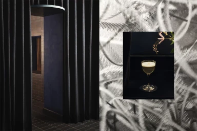
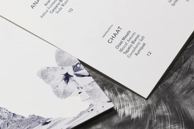
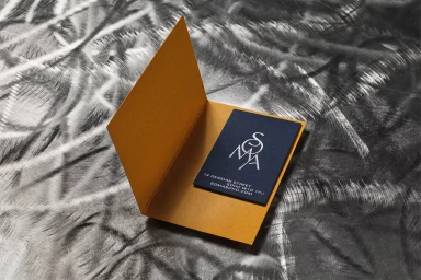
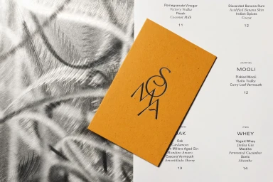
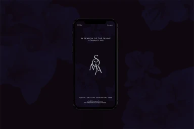
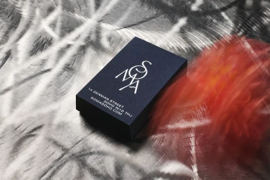
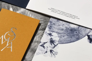
The brand identity for SOMA presents a cohesive visual system built on tactile paper textures and minimalist graphic design. Developed with graphic design studio The FUTURE they PROMISED, the project integrates physical collateral—including heavy-stock stationery, debossed cards, and specialty finishes from G . F Smith, Colorplan, and Gmund Bier—with a sophisticated digital presence. The visual language favors clean typography and sharp typographic hierarchy, set against moody, low-key lighting and industrial-inspired textures. Captured through editorial photography by Felix Speller, the project extends beyond stationery into the physical environment of the SOMA lounge. The identity balances deep, monochromatic tones with organic metallic accents, creating a professional aesthetic that translates across both printed menus and high-end smartphone interface mockups.
Horizontal, Clean, Commercial
Metal Texture
Advertising Campaign