
KO Productions
Brand Identity



Apr 2016
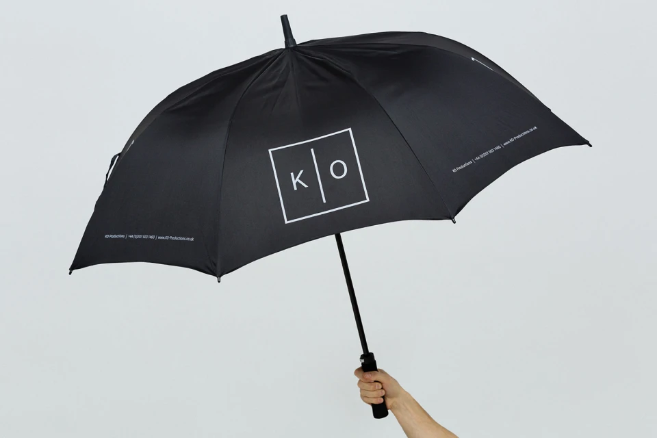
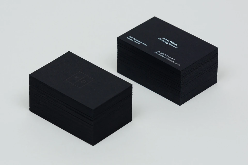
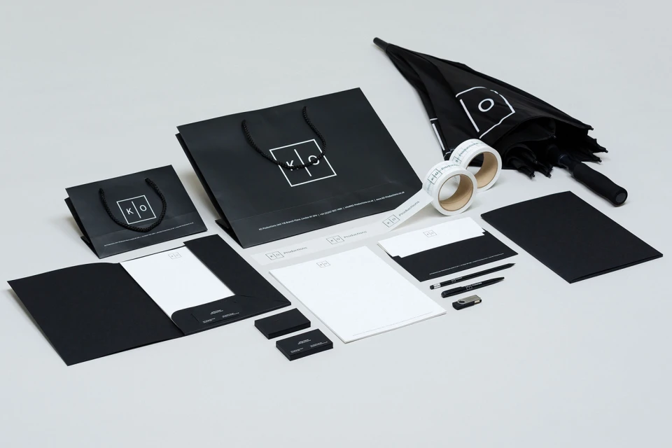
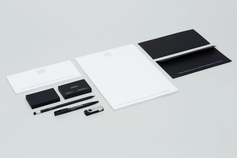
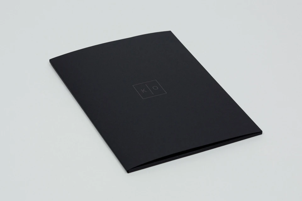
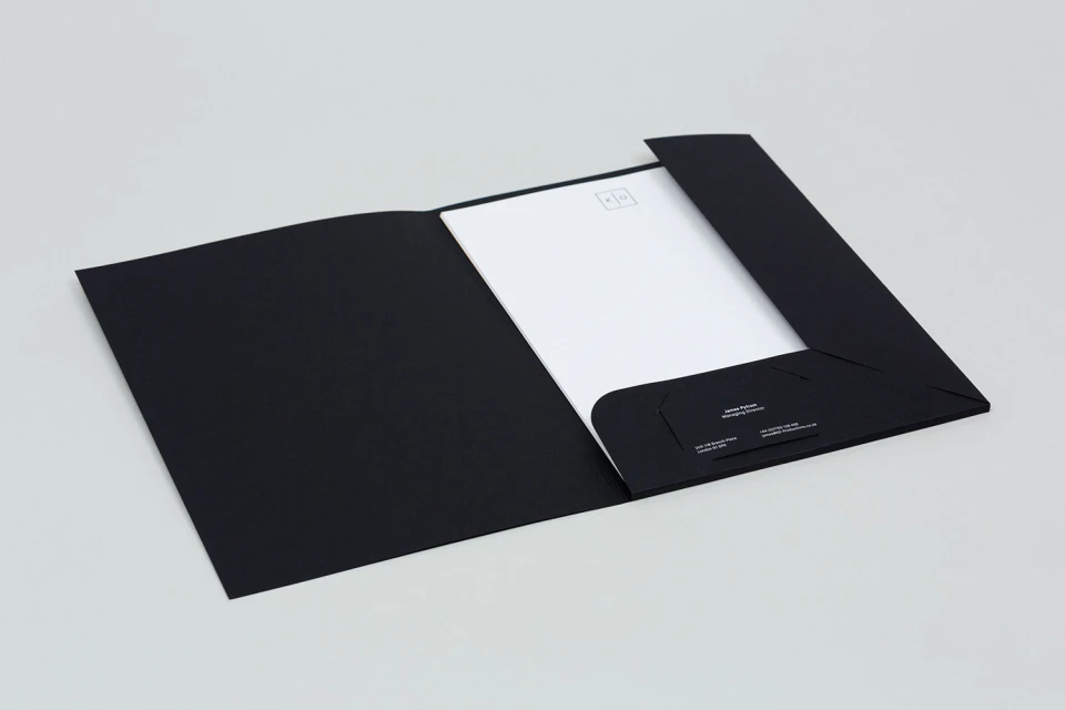
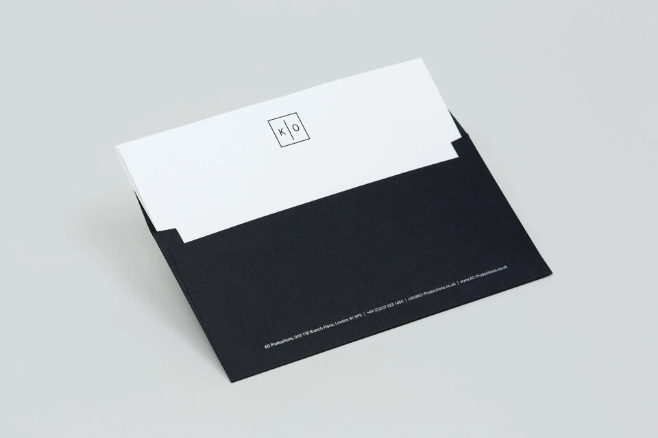
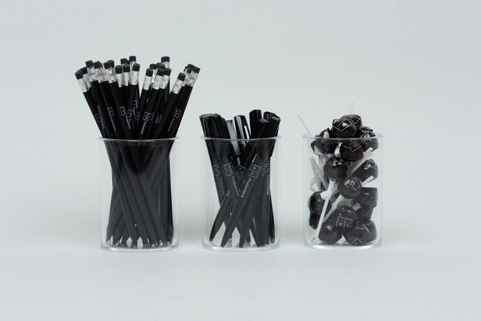
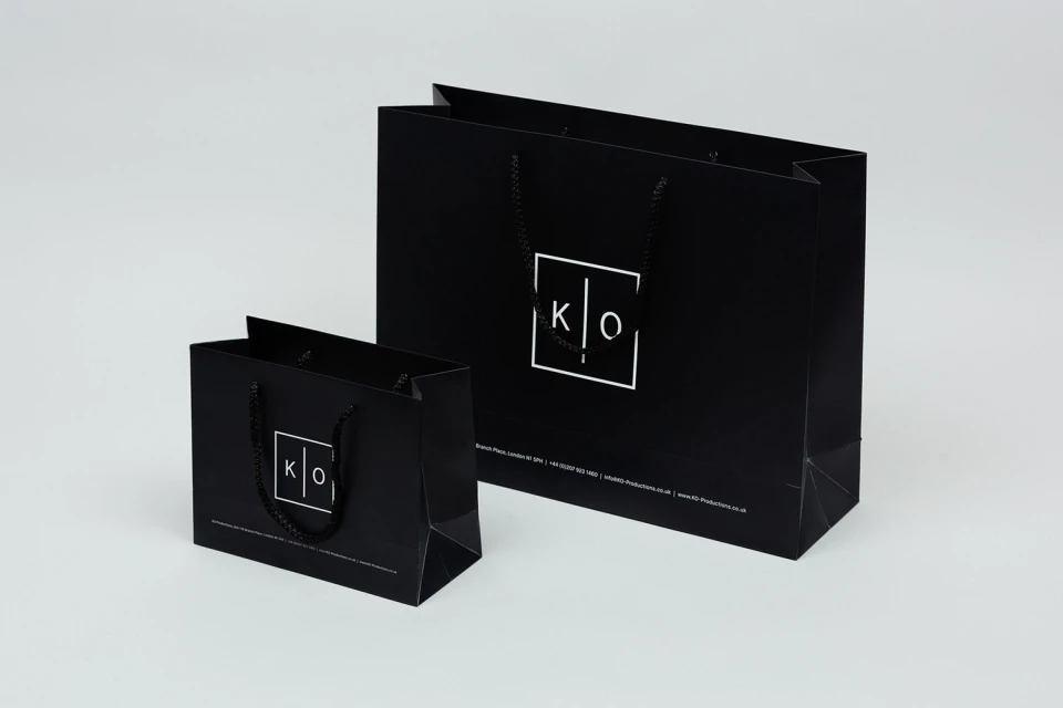
The brand identity for KO Productions establishes a visual language defined by uncompromising minimalism and a sophisticated monochromatic palette. By leveraging a high-contrast aesthetic that leans into the interplay of matte black surfaces and stark white typography, the design team at POST has crafted a cohesive corporate system that feels both modern and timeless. This project serves as a masterclass in editorial minimalism, demonstrating how a singular, geometric logomark—a square-framed K and O—can unify a sprawling collection of collateral. From the precision of the business cards and presentation folders to the functional elegance of the branded umbrellas and stationery sets, the identity system translates seamlessly across both physical goods and digital interfaces. The use of studio strobe photography emphasizes the crisp edges and material textures, further elevating the corporate collateral into a premium experience. Through deliberate UI illustration and consistent application across web and print, the brand identity projects a professional, high-end agency stature. The result is a refined, unified visual ecosystem that avoids clutter, allowing the work itself to remain the primary focus. Every element, from the custom-branded writing utensils to the digital portfolio layout, reinforces a sense of intentionality and clean, corporate structure, ensuring KO Productions maintains a distinct and recognizable footprint in the competitive landscape of creative services.
Horizontal, Commercial, Clean, Minimalist
White Seamless
E-commerce / Product
