
Rare by Nature: Brand Identity




Mar 2019
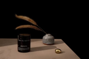
Rare by Nature establishes a striking visual language through its new brand identity, a project that seamlessly bridges the gap between clinical professionalism and raw, artisanal origin stories. Executed with a sophisticated eye by The Colour Club, the branding leans into a minimalist, corporate aesthetic that prioritizes clarity, precision, and tactile storytelling. By utilizing a restrained color palette of deep terracotta, muted beige, and sharp black, the identity conveys an aura of premium quality while grounding the consumer in the specific, traceable landscapes of the Western District of Victoria and the Fingal Valley. The photography, categorized by its commercial and editorial sensibilities, utilizes soft light and natural light techniques to accentuate the architectural silhouettes of the skincare and supplement packaging. Whether through high-key, sterile product shots or high-contrast, moody still lifes featuring botanical elements like kangaroo paw flowers, the imagery feels cohesive and deliberate. Typography plays a central role here, with sans-serif and serif arrangements that emphasize the brand’s commitment to being pure, powerful, and traceable. Through the integration of infographics and clean UI illustration, the project manages to translate complex geographic and nutritional data into an accessible, high-end format. The result is a refined brand ecosystem that treats packaging and graphic collateral as essential components of a unified, modern narrative.
Horizontal, Commercial, Clean, Minimalist
White Seamless
E-commerce / Product
