
Dulwich Butchery: Brand Identity
Jul 2018
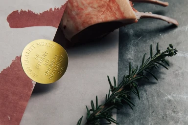
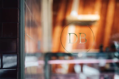
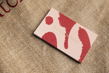
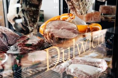
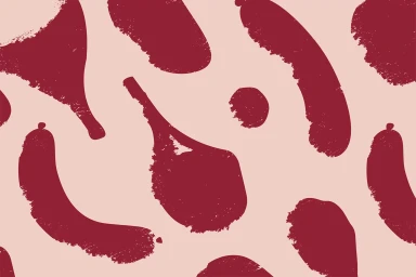
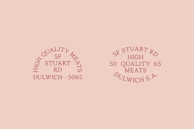
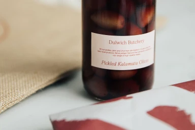
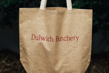
Dulwich Butchery transcends the traditional expectations of a local meat purveyor, repositioning itself as a premium culinary destination through a masterfully cohesive brand identity. Orchestrated by The Colour Club, this project is a lesson in tactile storytelling and commercial elegance, blending rustic elements with high-end corporate refinement. The visual language leans into a sophisticated palette of blush pink, deep maroon, and warm metallic gold, utilizing clean typography and deliberate material choices—such as coarse burlap and matte paper stocks—to create a sense of artisan tradition. Throughout the campaign, the imagery captures a delicate balance between organic, raw food textures and the polished precision of professional branding. Techniques like emboss and deboss are employed to add dimensionality to packaging, while the recurring stamp motifs and minimalist logo placement ensure that the brand remains recognizable across diverse touchpoints, from storefront glass and retail stationery to functional tote bags. The aesthetic channels a modern, boutique sensibility that feels both grounded in local heritage and entirely current. By prioritizing a clean, high-key approach with soft lighting, the design team effectively highlights the quality of the products, framing them as a lifestyle-focused experience rather than mere commodities. This comprehensive approach to identity design solidifies Dulwich Butchery as an authority in the food and beverage industry, setting a new standard for butchery branding that is as visually compelling as it is professional.
Horizontal, Commercial, Clean
Advertising Campaign
