
East Village Sydney
Brand Identity
Oct 2017
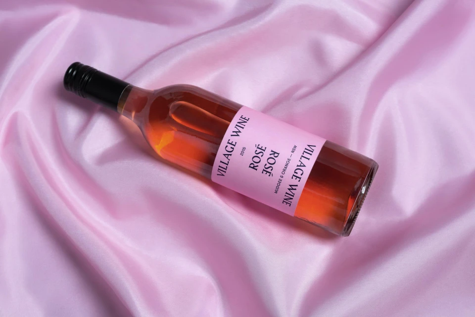
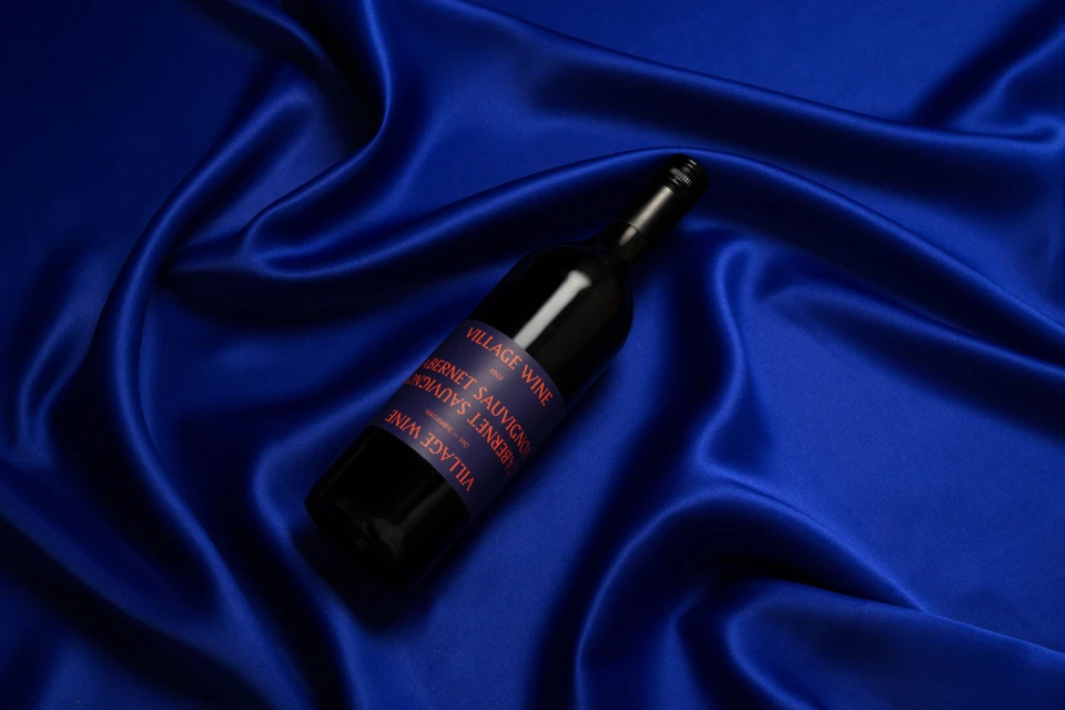
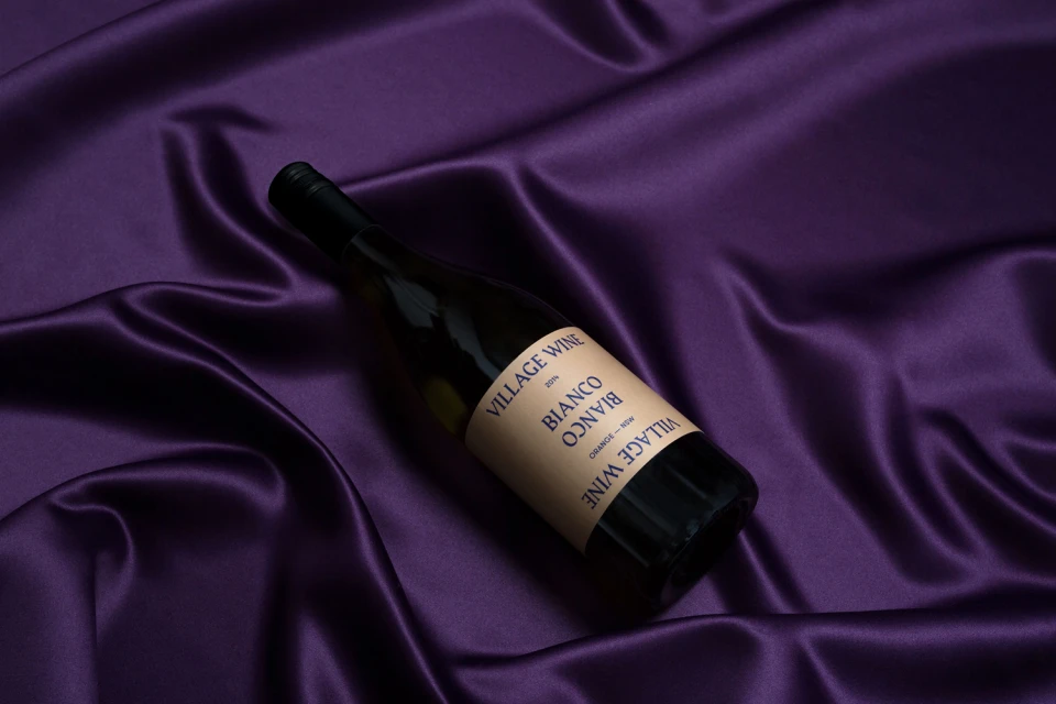
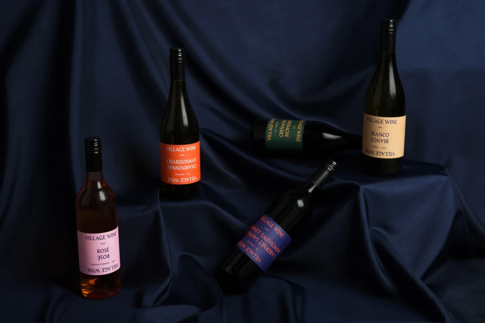
The brand identity for East Village Sydney marks a bold departure in the competitive alcoholic beverages and food and beverage sector, favoring a refined, minimalist aesthetic that leans into tactile luxury. Through a series of sophisticated commercial product shots, the project establishes a cohesive visual language where the architecture of the bottle meets the fluidity of fine textiles. The Colour Club expertly bridges the gap between premium positioning and approachable modernity, employing a color-coded labeling system that offers both clarity and shelf appeal. Each composition utilizes either soft natural light or precise studio strobe techniques to highlight the lustrous quality of silk and satin backdrops, creating a deliberate textural contrast against the smooth glass of the vessels. The brand, Village Wine, is presented as an exercise in editorial minimalism, with the bold, clean typography acting as the primary anchor against the rich, moody palette of the fabric folds. By focusing on high-quality representation and a streamlined design philosophy, the project avoids common industry tropes, opting instead for a deliberate, elegant presentation that emphasizes the craftsmanship of the product itself. This identity feels both grounded in its origin and elevated by its execution, successfully communicating a premium narrative through clever use of material contrast and balanced, centered compositions that define the brand as both contemporary and timelessly curated.
Horizontal, Commercial, Glossy
Alcoholic Beverages
Fabric Texture
E-commerce / Product
