
East Village Sydney
Brand Identity
Nov 2017
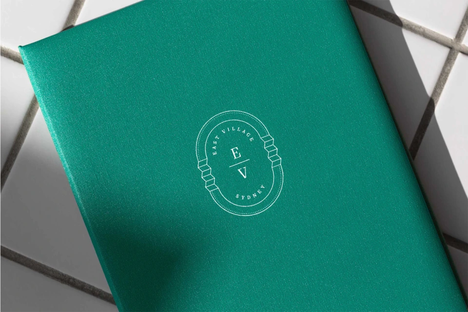
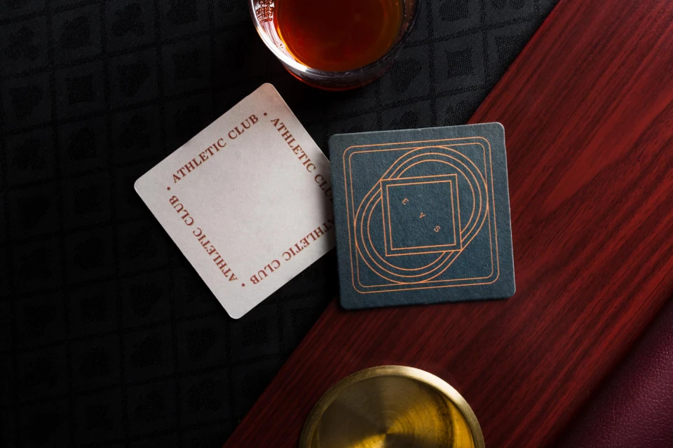
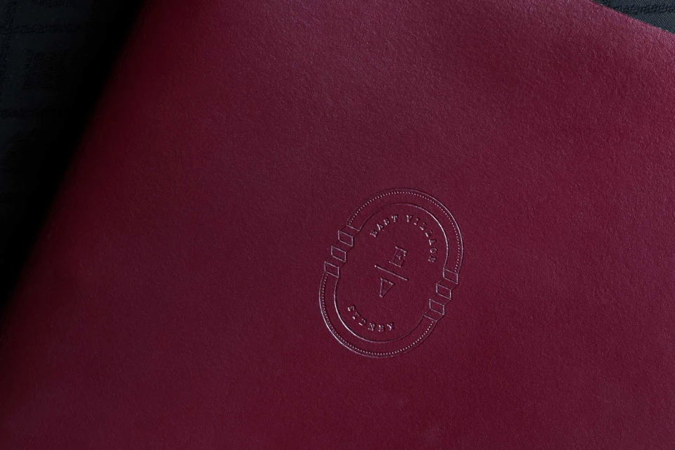
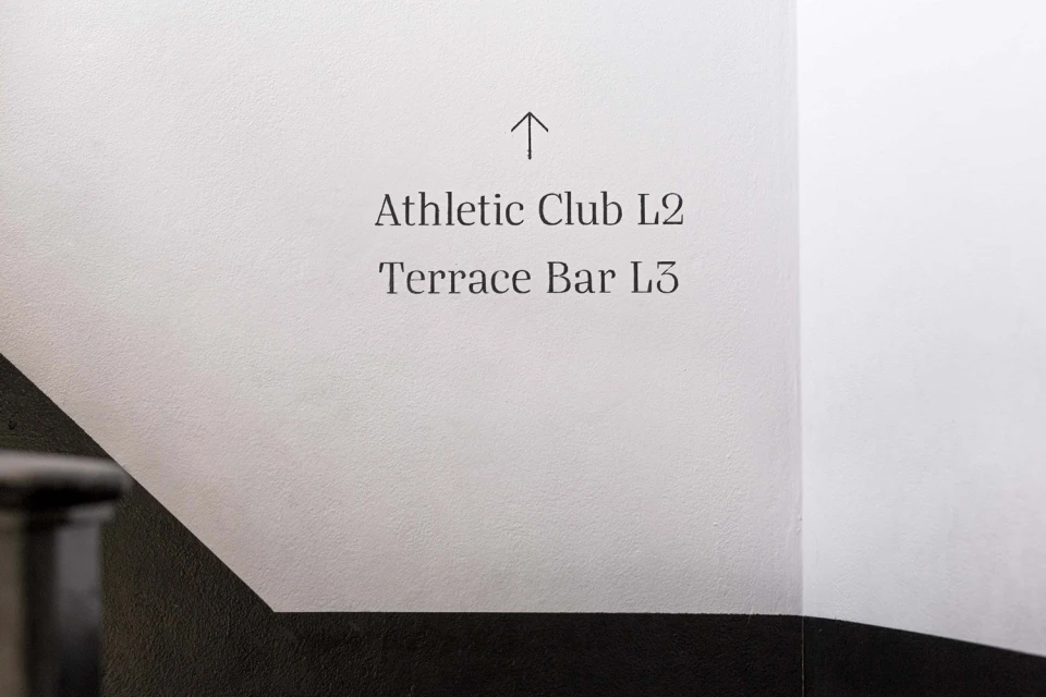
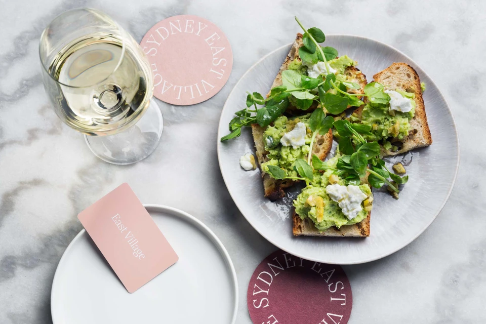
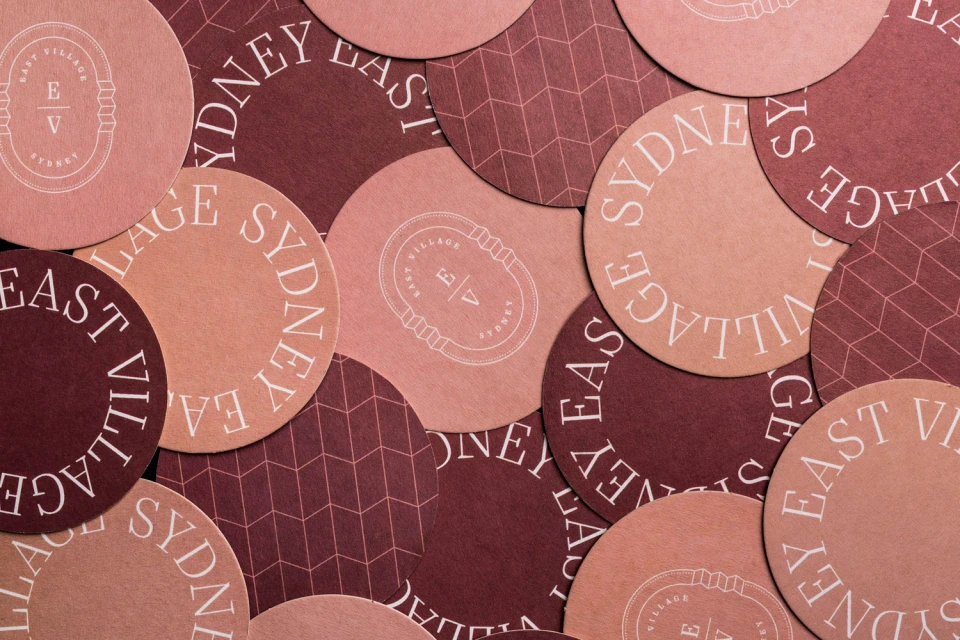
The brand identity for East Village Sydney masterfully translates a sense of elevated hospitality into a tangible, high-end visual language. Through a cohesive application of commercial design, the project establishes a sophisticated atmosphere that bridges modern architecture with refined culinary experiences. By leaning into editorial minimalism, the identity utilizes a deliberate color palette of deep burgundy, soft dusty pink, and vibrant teal to create depth across various touchpoints. The project, brought to life through the expert graphic design work of The Colour Club, relies on the tactile quality of premium materials, such as embossed matte paper and textured finishes, to ground the brand in physical reality. Each element, from the minimalist circular logo featuring classic serif typography to the precise placement of signage, communicates a commitment to craftsmanship. The inclusion of commercial food photography showcasing artisanal brunch spreads on white marble surfaces further anchors the brand in a lifestyle-centric environment. The design approach is defined by its clean, high-angle compositions and an intelligent use of natural light that highlights subtle textures and typography. By consistently applying these motifs—whether on custom coasters, signage, or printed collateral—the identity feels both cohesive and inviting, successfully positioning East Village Sydney as a destination that values the intersection of professional branding and the sensory nuances of the hospitality sector.
Horizontal, Commercial, Clean
Advertising Campaign
