
Eat Furniture
Brand Identity
Sep 2017
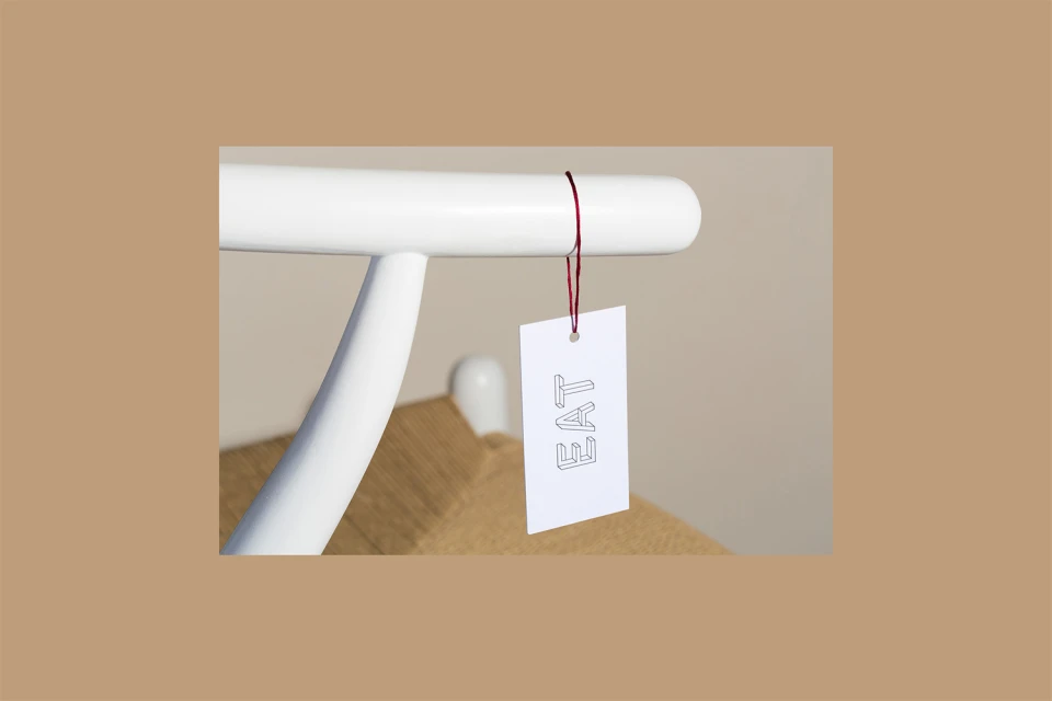
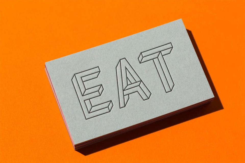
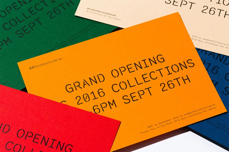
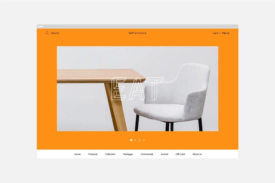
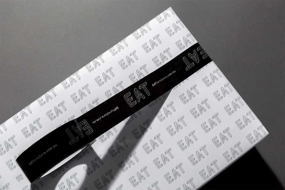
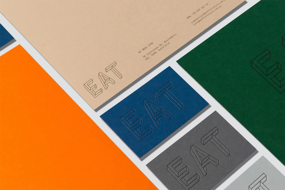
The brand identity project for Eat Furniture serves as a masterclass in modern retail design, masterfully bridging the gap between digital e-commerce platforms and tactile physical collateral. Orchestrated by the creative team at The Colour Club, the identity leans into a bold, minimalist aesthetic that feels both approachable and structurally sophisticated. At its heart lies a clever, multi-faceted approach to typography, where the brand name EAT is transformed through varied iterations ranging from clean sans-serif typefaces to complex, Escher-style geometric illusions. By utilizing natural light and high-contrast color blocking, the execution highlights the interplay between industrial furniture textures and the vibrant, saturated palette of the brand’s stationery and packaging design. Every touchpoint, from the UI illustration of the website homepage to the carefully embossed business cards and branded shipping boxes, maintains a rigorous visual consistency. The project expertly utilizes typography as a core structural element, ensuring that the brand’s identity is not merely applied, but deeply integrated into every surface. With a focus on clean layouts and precise material choices, this identity captures the essence of a modern furniture retailer that values both form and function. The final result is a cohesive and highly memorable brand identity that stands out in a crowded market by prioritizing clear, geometric rigor and a playful, yet restrained, graphic language.
Horizontal, Commercial, Clean, Minimalist, Graphic
Typography
Advertising Campaign
