
Petty Well: Brand Identity


Brand
Date
Jul 2021
Description
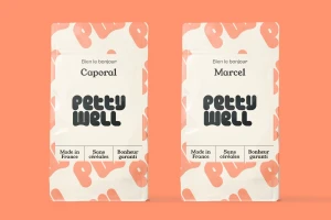
Petty Well's brand identity, developed by graphic design studio Brand Brothers, establishes a cohesive visual language across packaging, print collateral, and outdoor advertising. The project leans into a minimalist aesthetic, utilizing bold, rounded black typography and a palette of pastel tones to define the brand's consumer presence. Execution across the identity system incorporates vector-based iconography and clean layouts. These design elements are applied consistently from commercial shipping boxes to corporate business cards and large-scale billboards, maintaining a playful, modern feel that integrates narrative French copy with distinctive graphic motifs.
Style
Horizontal, Commercial, Clean, Minimalist
Techniques
Typography
Color
Pure White
Jet Black
Associated creatives

5000+ creatives to discover
Sign up to gain access to the entire directory. It’s free.
Visie is a curated library of creative professionals.