
Apocope: Brand Identity

Brand
Date
Sep 2021
Description
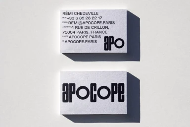
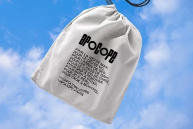
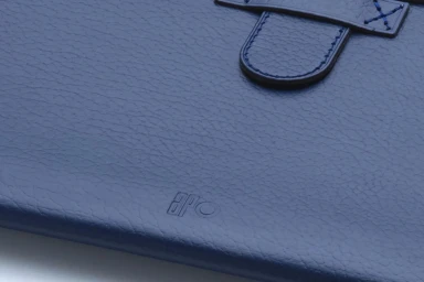
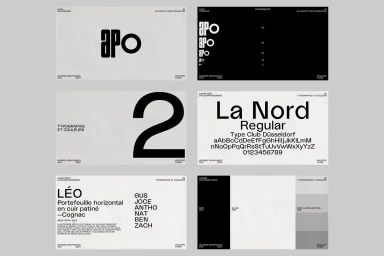
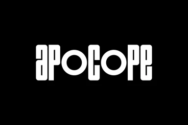
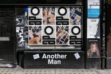
Brand Brothers developed the visual identity for Apocope, establishing a cohesive design system defined by its monochrome palette and geometric typography. The project centers on a heavy, custom wordmark applied across varied collateral, ranging from business cards and canvas bags to textured navy leather goods. The visual language leans into a minimalist aesthetic, utilizing high-contrast compositions and precise grid alignment to maintain clarity across corporate and commercial touchpoints. Tactile elements like debossed logo applications and screen-printed posters further differentiate the identity, adding physical depth to the stark graphic design work.
Style
Horizontal, Commercial, Clean
Techniques
Typography
Color
Pure White
Jet Black
Context
Advertising Campaign
Associated creatives

5000+ creatives to discover
Sign up to gain access to the entire directory. It’s free.
Visie is a curated library of creative professionals.