
Bécot: Brand Identity
Brand
Date
Jan 2021
Description
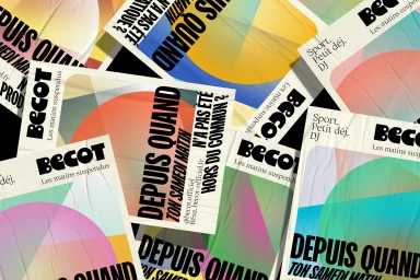
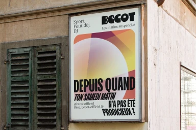
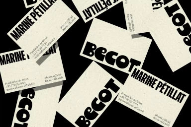
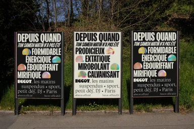
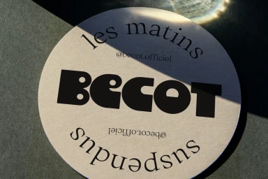
The brand identity for Bécot, developed by Brand Brothers, centres on a high-contrast graphic language. The system utilises bold, sans-serif typography set against minimalist, textured paper backgrounds, punctuated by colourful, abstract geometric gradients. Executed through a mix of digital compositions and outdoor editorial placements, the visual identity anchors the brand's presence with a focus on tactile details. From business cards to large-format outdoor billboards, the work employs typography and clean graphic layouts to establish a cohesive visual presence.
Style
Clean, Commercial
Techniques
Typography
Color
Jet Black
Off-White
Context
Advertising Campaign
Associated creatives

5000+ creatives to discover
Sign up to gain access to the entire directory. It’s free.
Visie is a curated library of creative professionals.