
Tweag: Brand Identity
Jul 2020
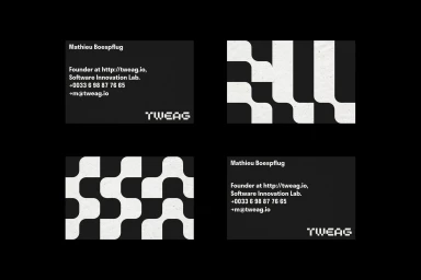
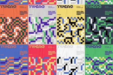
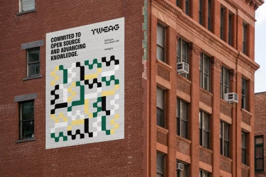
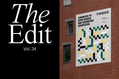
The brand identity for Tweag, developed through a collaborative design effort, serves as a masterclass in modular systems and visual consistency. By leaning into a striking modernist aesthetic, the project successfully defines a clear software innovation lab identity that thrives on structural order and bold, high-contrast typography. The execution relies heavily on a systematic approach to graphic design, where interlocking organic shapes and pixelated-style typefaces create a cohesive narrative across diverse physical and digital touchpoints. From the stark, professional minimalism of its corporate stationery to the expansive, vibrant geometry of its environmental murals, the system utilizes a recurring grid-based logic that feels both expansive and highly disciplined. This project, which integrates elements of UI illustration and expert typography, effectively balances a gritty, urban-inspired grit with the clean, polished output of a high-tech lab. Through the collective vision of creative partners like Brand Brothers, Bright Bright Great, and Campbell Hay, the work avoids the trap of repetitive branding by ensuring each application—whether on textured brick facades or high-end matte print collateral—maintains a distinct personality within the broader design ecosystem. The final output demonstrates a sophisticated command of commercial branding, proving that a rigid, rule-based approach to layout and color can remain flexible enough to communicate complex engineering power while maintaining a clean, contemporary edge in a crowded market.
Horizontal, Commercial, Clean


