
Chillon Castle
Brand Identity
Apr 2026
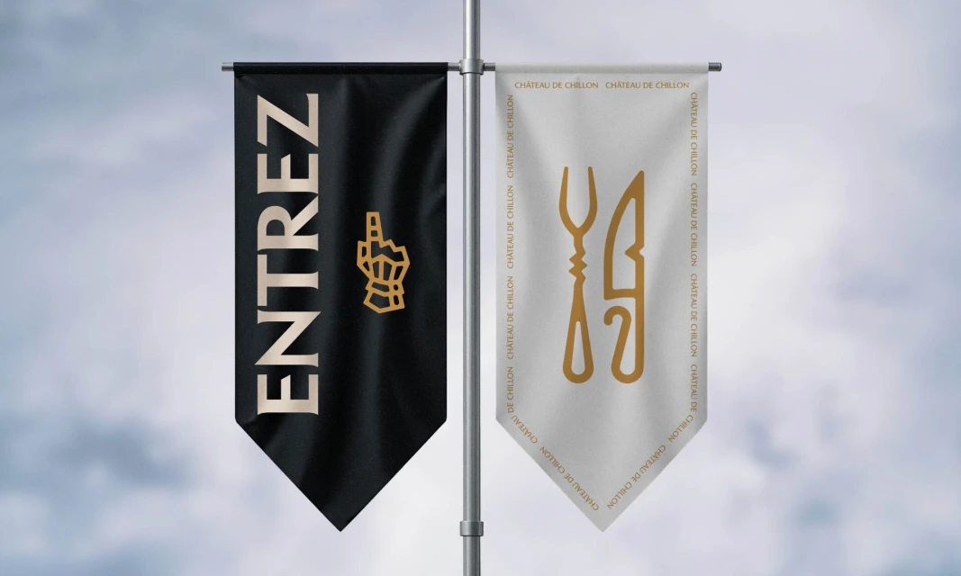
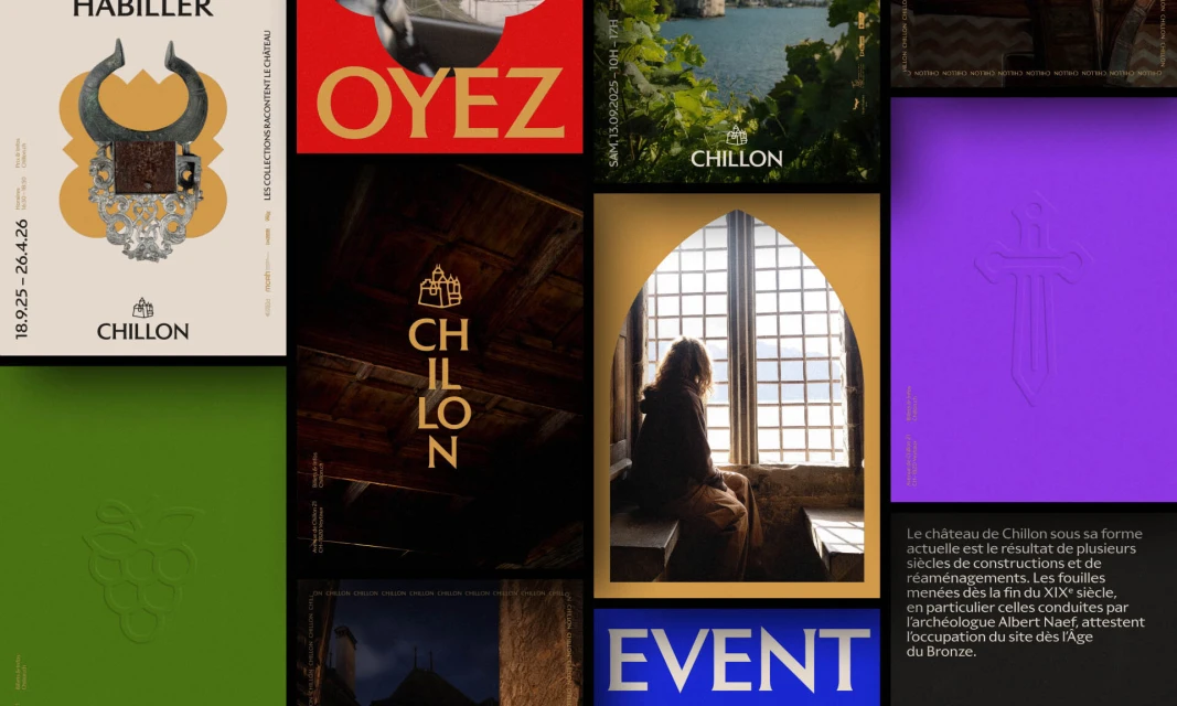
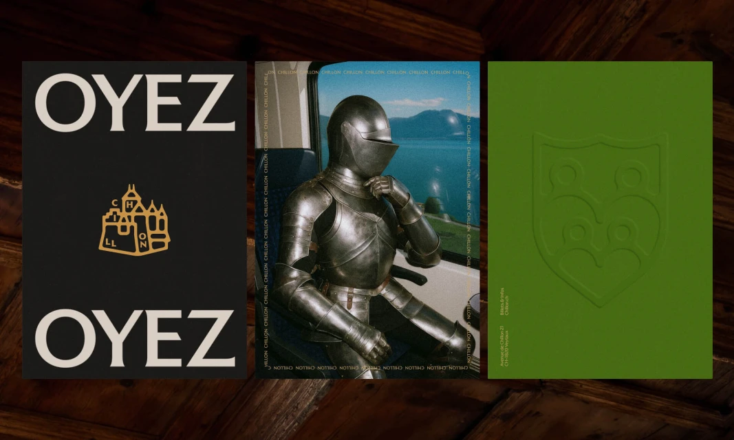
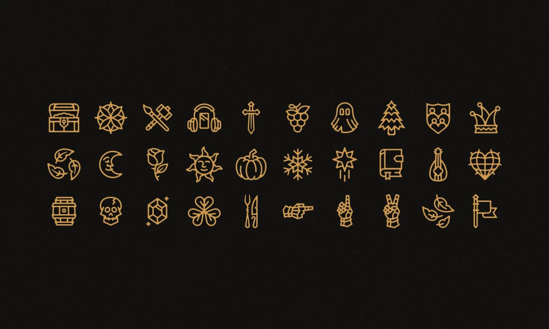
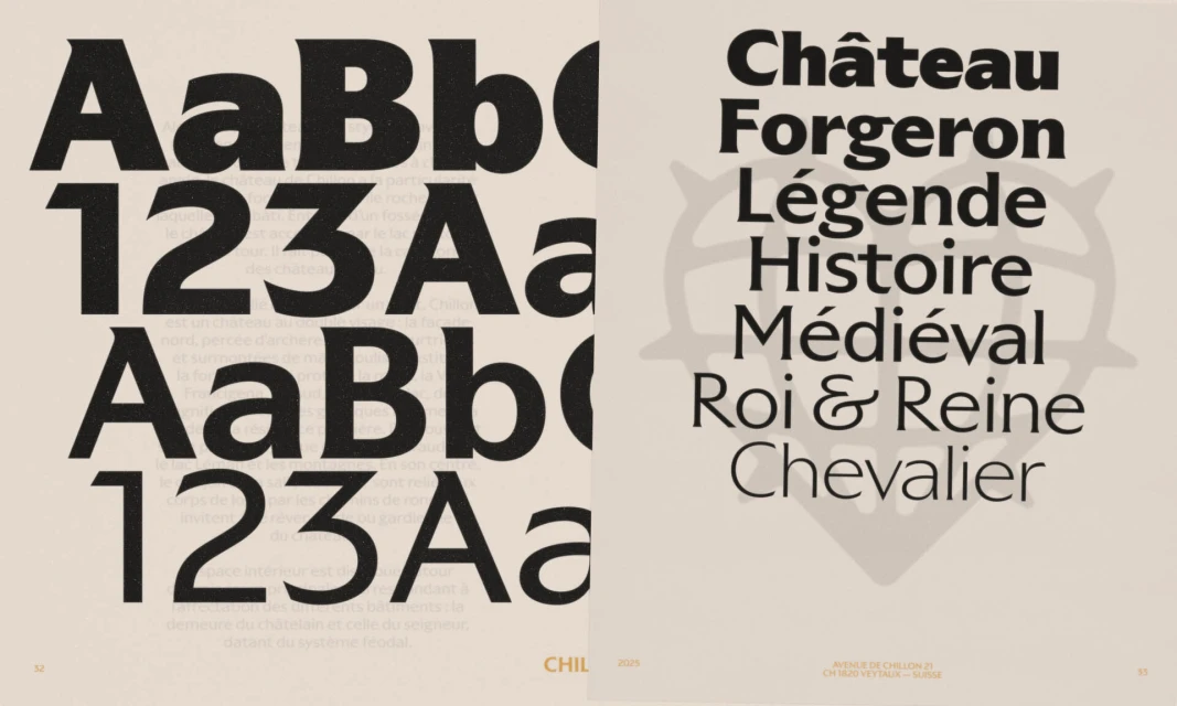
Chillon Castle has unveiled a sophisticated new brand identity that masterfully bridges the gap between centuries-old heritage and contemporary design sensibilities. Developed by the design team at Hymn, the project creates a visual language that feels both authoritative and approachable, effectively repositioning a historical landmark for the modern visitor. The design system leans into editorial minimalism, utilizing a high-contrast palette of deep blacks, soft creams, and accents of muted gold that evoke the weight of medieval history without feeling dusty or academic. A standout component of the work is the extensive library of thirty minimalist line icons, rendered in a crisp vector format, which distill complex symbols of folklore, nature, and chivalry into a cohesive, scalable graphic system. This typography-led approach is further anchored by bold, serif-driven headlines that pair classical sensibilities with modern legibility. Whether displayed on high-impact fabric banners or tactile print collateral, the branding utilizes structural layout and professional 3D render techniques to maintain consistency across every touchpoint. By integrating playful, unexpected imagery—such as a suit of armor commuting by train—with a strict, disciplined typographic framework, the team has crafted a versatile identity that honors the site’s legendary past while inviting a new, design-conscious audience to engage with its enduring narrative.
Horizontal, Commercial, Clean
