
BrandParking Riponne SA
ProjectBrand Identity
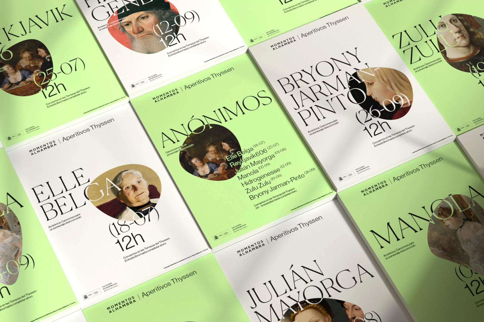
Parking Riponne SA Brand Identity 2020
Associated creatives


Tags
Description
This high-angle composition displays a collection of promotional posters designed for Parking Riponne SA as part of a brand identity project. The layouts feature a striking combination of vibrant green and white fields, paired with sophisticated serif typography and circular crop windows framing classical portrait artworks. Diagonal shadows fall across the arrangement, adding depth and a tangible sense of light to the flat-lay view. The design system integrates structured brand elements with artistic imagery to create a cohesive visual language.
Style
Editorial, Horizontal, Clean, Graphic
Techniques
Typography
Color
Pure White (50%)
Sage (50%)
Background
Paper Texture
Context
Advertising Campaign