
OJI: Brand Identity
Aug 2020
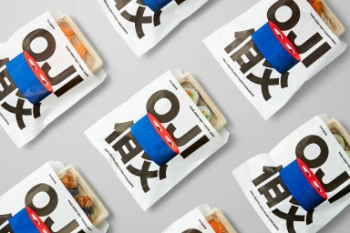
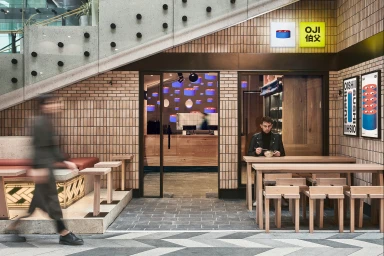
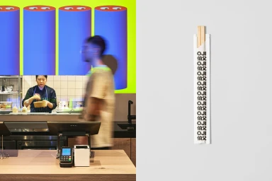
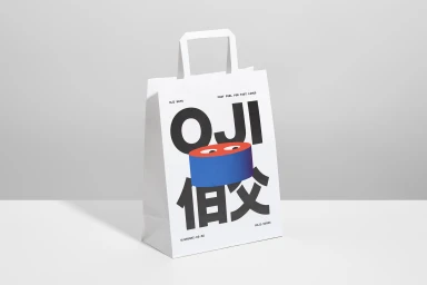
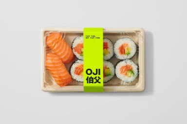
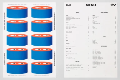
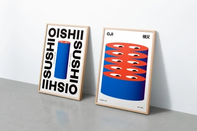
The brand identity for OJI, crafted by Seachange, strikes a sophisticated balance between playful graphic expression and systematic functionality within the competitive restaurant and food and beverage landscape. This commercial identity project leans into a minimalist, high-contrast aesthetic that elevates everyday culinary interactions. By utilizing a bold sans-serif typography paired with quirky, eye-inspired illustrations, the brand manages to feel both accessible and distinctly modern. The visual language, executed with expert vector precision, flows seamlessly from the storefront signage to the sustainable packaging, where neon green bands and vibrant blue and orange accents create an immediate shelf presence. The integration of live-action techniques in the restaurant environment, featuring natural light and intentional slow motion, captures the brand in motion, emphasizing its identity as a provider of high-quality fast fuel. Whether through the clean composition of an overhead sushi tray or the geometric storytelling of its posters, OJI demonstrates how intentional design can transform functional, everyday objects into a cohesive lifestyle statement. The work channels a contemporary energy that feels perfectly suited for a fast-paced urban dining experience, where every detail, from the textured brick interiors to the stark, minimalist menu boards, serves to reinforce a clear and memorable brand personality that is as functional as it is visually arresting.
Horizontal, Commercial, Clean
White Seamless
Advertising Campaign
