
Cazador: Brand Identity



Aug 2019
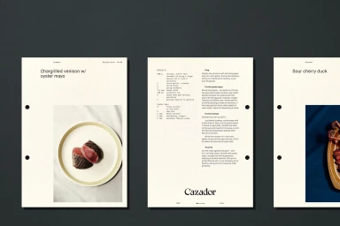
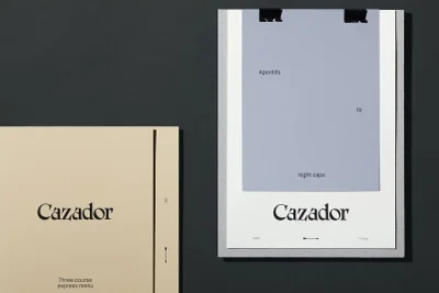
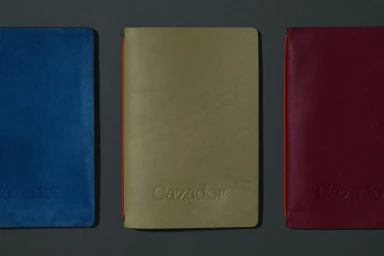
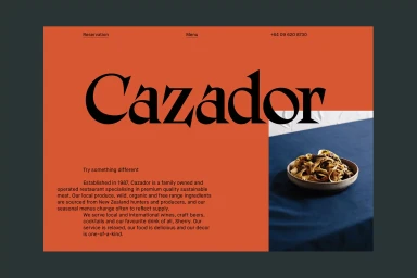
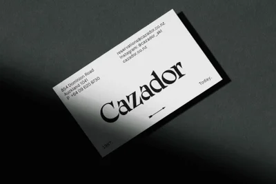
The brand identity for Cazador, executed by the design studio Seachange, serves as a masterclass in minimalist hospitality design within the competitive landscape of the restaurant, food, and beverage industry. Through an editorial approach to commercial assets, the project constructs a tactile and sophisticated narrative that extends far beyond the traditional logo. The visual language relies heavily on disciplined typography, contrasting sharp, high-contrast serif letterforms against bold, monochromatic fields of terracotta orange and charcoal gray. This deliberate restraint emphasizes the brand’s refined character, utilizing techniques like subtle emboss and deboss detailing on leather notebooks and textured paper stock to elevate the guest experience. From recipe cards and menu folders to business cards that employ low-key chiaroscuro lighting, every element feels intentional. The project leans into a clean, modern aesthetic that successfully balances organic textures—such as suede covers and olive green accents—with the crisp precision of digital UI illustration. By weaving together consistent design motifs, including minimalist arrow icons and evocative copy, Seachange has created a cohesive, professional identity system that feels both timeless and distinctly contemporary. It is a striking example of how typography, paired with carefully curated material choices, can define the soul of a brand and transform everyday collateral into a signature piece of the dining experience.
Horizontal, Commercial, Clean, Minimalist
Typography
Advertising Campaign
