
PAGE: Brand Identity
May 2020
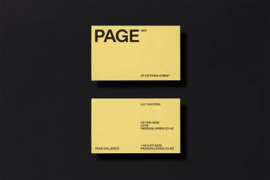
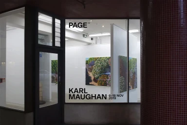
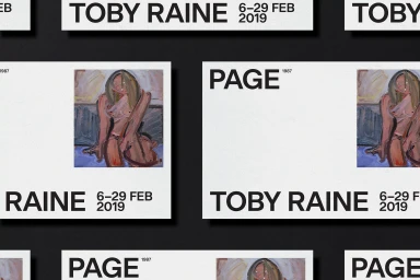
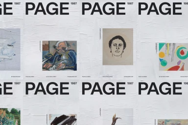
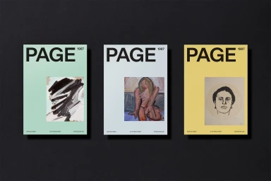
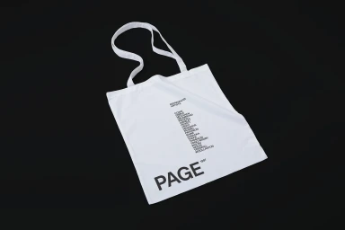
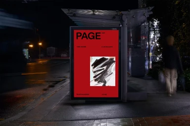
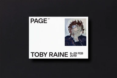
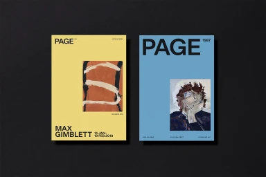
The brand identity for PAGE galleries serves as a masterclass in editorial minimalism and systematic design within the Digital Media and Publishers sector. Crafted with precision by the studio Seachange, the identity relies on a rigorous typographic hierarchy that anchors the institution's 1987 heritage while providing a flexible framework for its rotating exhibition schedule. By utilizing a bold, sans-serif typeface in stark black against a palette of vibrant yellow, mint green, and pale blue, the visual language achieves a high-impact contrast that bridges the gap between commercial corporate messaging and artistic expression. The project expertly utilizes techniques such as high-key lighting for tactile collateral like tote bags and business cards, alongside cinematic live-action captures of street-side billboards that ground the brand in an urban context. Across every touchpoint—from exhibition posters featuring expressive oil paint textures to glass-fronted storefronts—the design remains disciplined. By prioritizing clean spatial arrangements and generous negative space, the identity allows the gestural, painterly work of featured artists like Toby Raine to take center stage. Ultimately, this body of work demonstrates how a modern, structured layout can effectively unify diverse visual media, ensuring that the brand remains recognizable and sophisticated while celebrating the raw, emotive quality of the contemporary art it represents.
Horizontal, Commercial, Clean, Minimalist
Typography
Advertising Campaign
