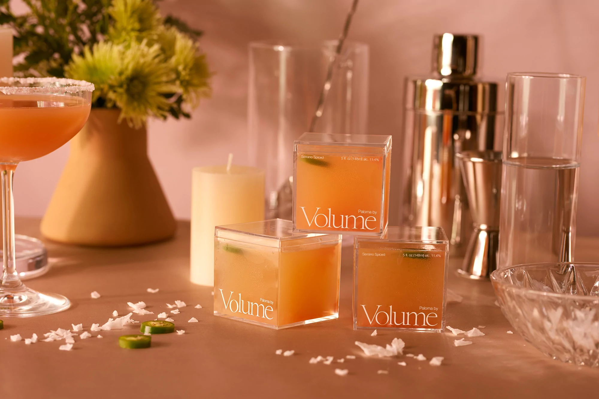
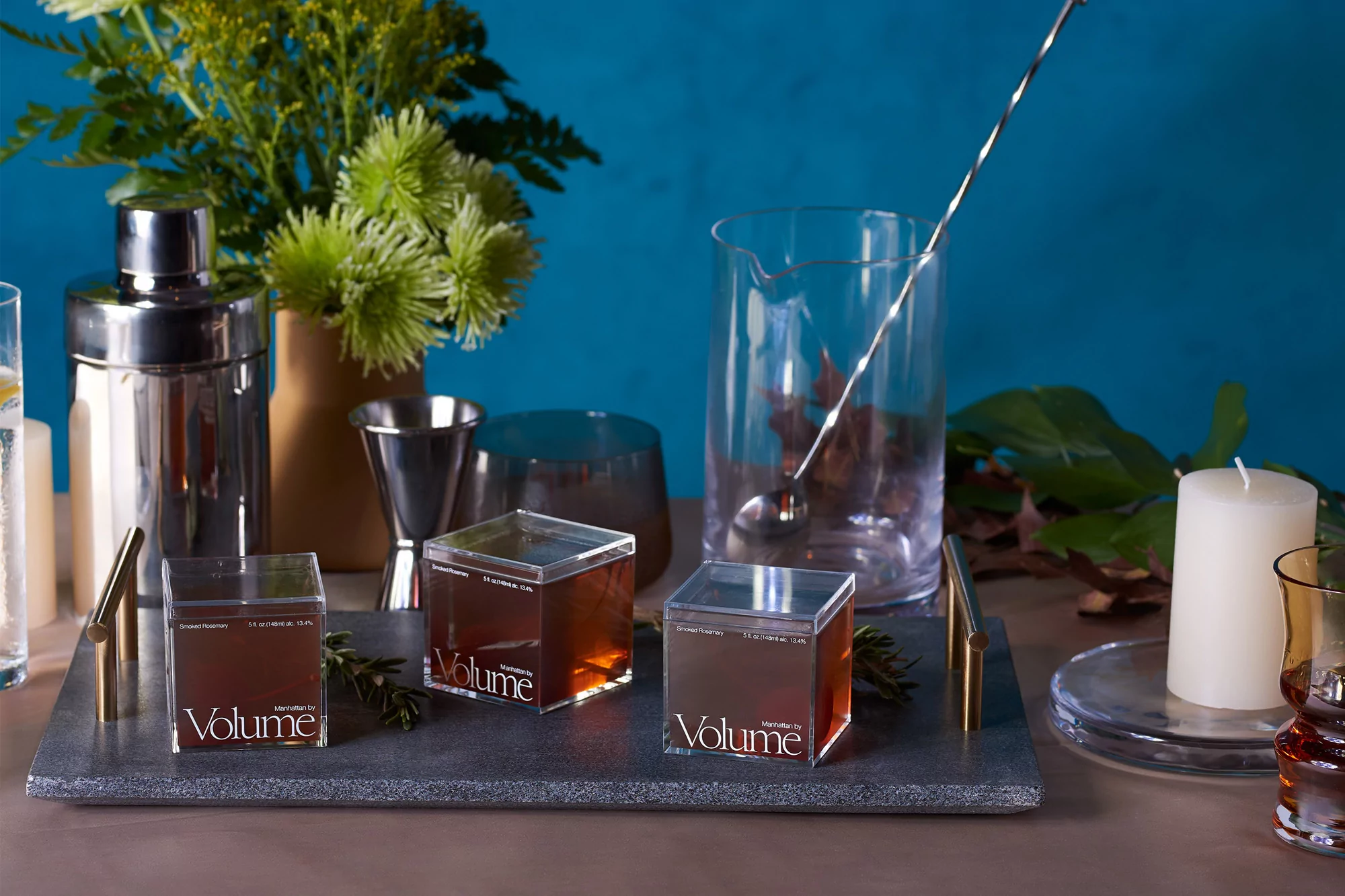
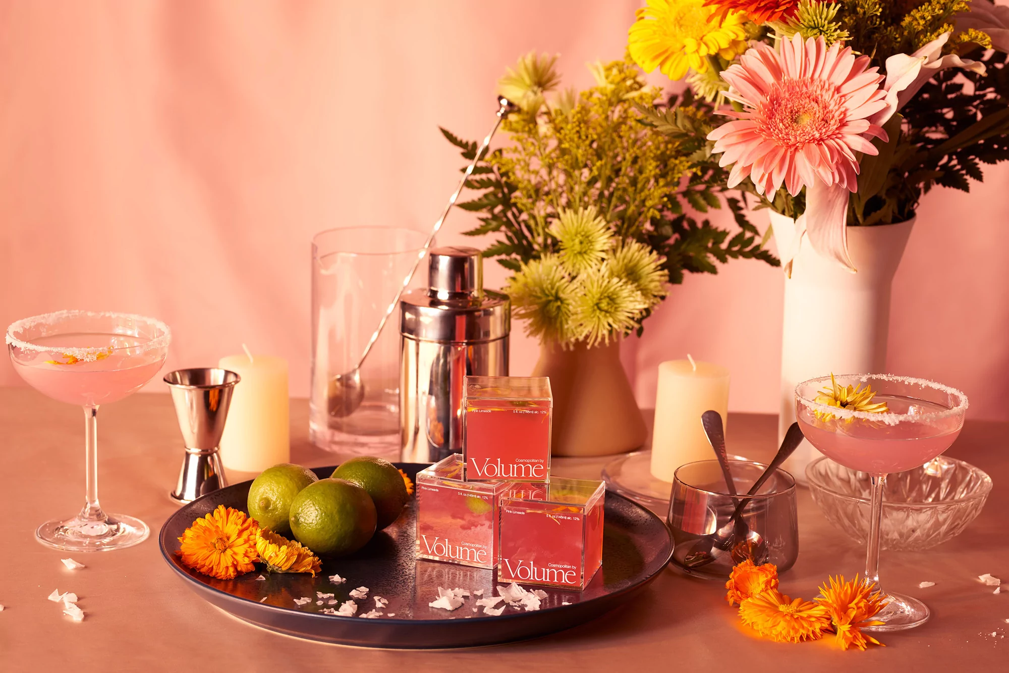
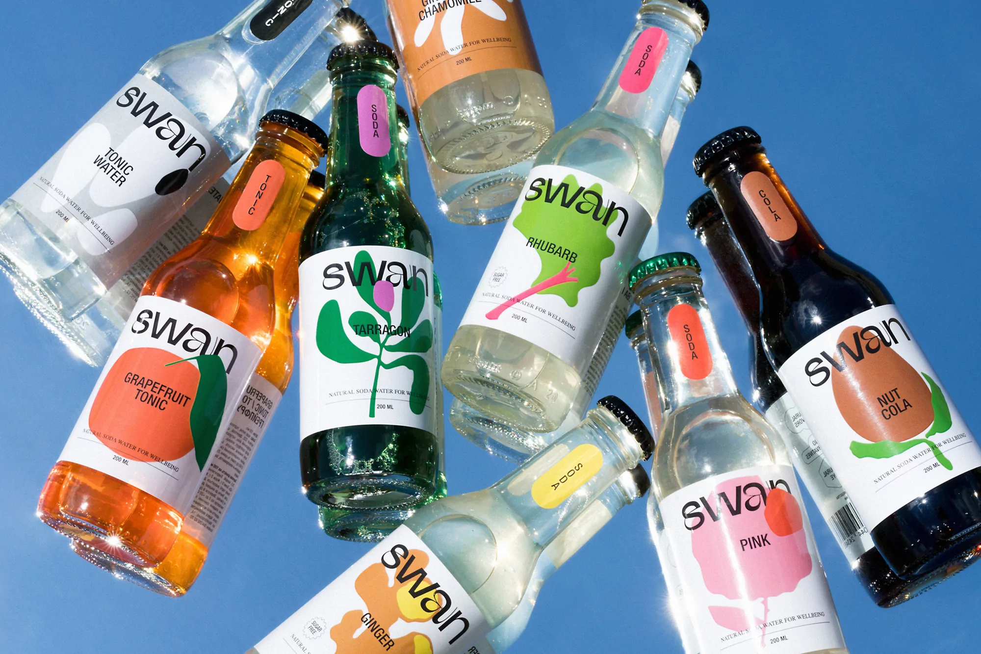
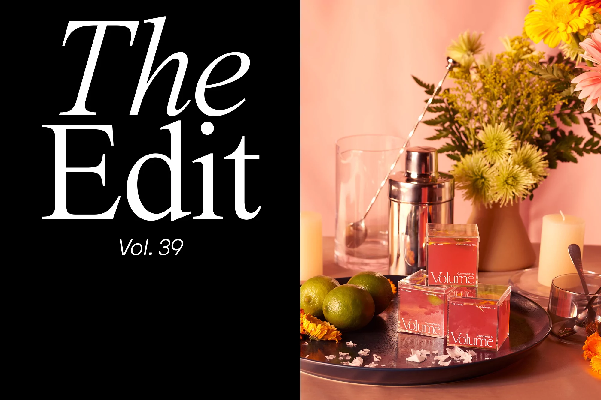
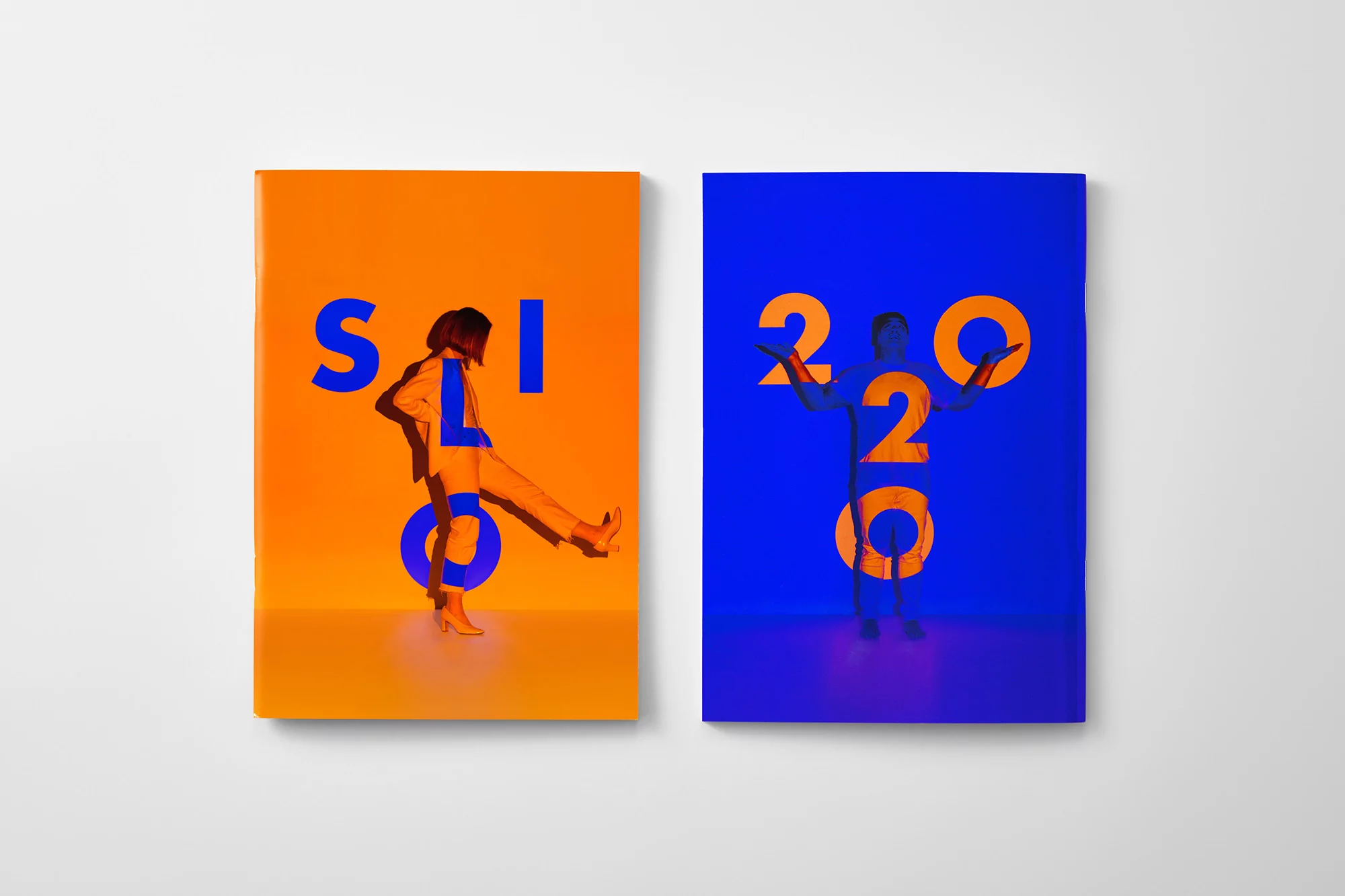
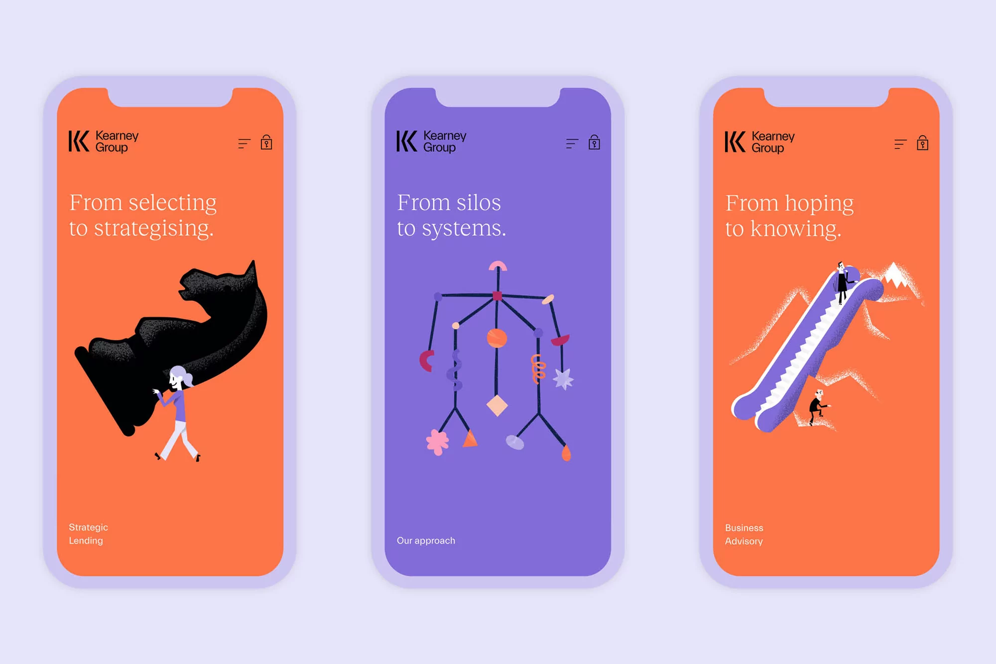
Volume's brand identity project serves as a masterclass in modern visual communication, balancing playful product presentation with sophisticated corporate design. Through a series of carefully curated commercial still-life compositions, the project demonstrates a cohesive aesthetic that seamlessly bridges the gap between lifestyle beverage photography and structured, professional service branding. The visual narrative leans into a high-end, cinematic sensibility, utilizing natural light and soft light techniques to emphasize the translucency of product packaging and the vibrant, saturated color palettes that define the brand. Beyond the tactile tabletop arrangements—which feature artisanal details like salt-rimmed glassware and floral accents—the project extends its minimalist design language into digital territories. The integration of high-contrast vector illustrations, bold typographic arrangements, and functional UI elements showcases a strategic approach to identity, effectively grounding the brand in both physical and virtual spaces. Executed with precision by a collaborative team including Ching-Fa Lung, Yu ra Park, Self-titled, Seachange, Orchidea Agency, and Peter Trigar, the work maintains a rigorous consistency across disparate media. Whether manifested in the artistic graphic posters or the clean, modular interface screens, the identity remains sharp and purposeful, proving that successful brand storytelling lies in the thoughtful intersection of playful minimalism and professional execution.