
TeTuhi: Brand Identity
Sep 2020
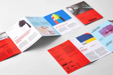
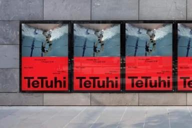
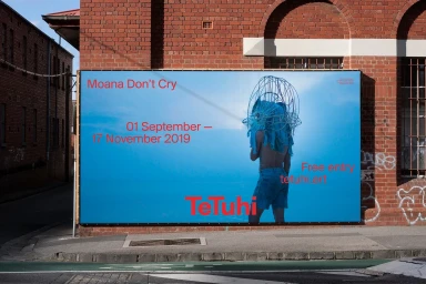
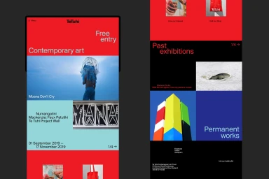
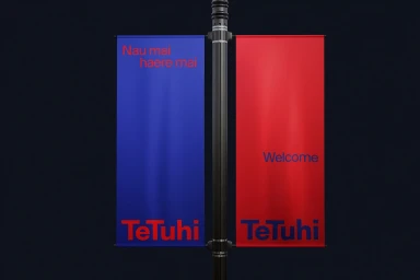
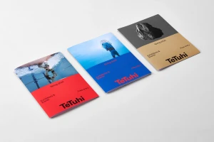
The brand identity project for TeTuhi serves as a masterclass in modern institutional design, breathing new life into the arts organisation through a rigorous application of high-contrast colour blocking and minimalist typography. Helmed by the design studio Seachange, the identity system leans into a bold, primary-focused palette of red, blue, and white that immediately establishes a commanding visual presence across diverse touchpoints. Whether manifesting as sharp, geometric print collateral in a studio setting or large-scale outdoor signage anchored against weathered urban brick, the aesthetic remains consistently striking and legible. The project expertly balances photographic vignettes with clean, sans-serif messaging, ensuring that the brand feels both avant-garde and accessible. Web development partner Grafik has successfully extended this visual language into a digital ecosystem, translating the identity’s block-based structure into a fluid mobile interface that prioritizes readability and user engagement. From the intricate, live-action technique employed in billboard imagery to the precise 3D render and CGI applications used in environmental mock-ups, the execution is seamless. This corporate branding project demonstrates how a coherent design framework—defined by its striking use of underwater photography and disciplined spatial layout—can effectively unify an arts institution’s complex program of exhibitions, classes, and shops while maintaining a sophisticated, contemporary edge that resonates within the wider commercial landscape.
Horizontal, Commercial, Clean
Typography

