
Norwegian Seafood Council: Brand Identity


Date
Nov 2021
Description
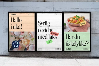
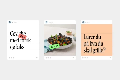
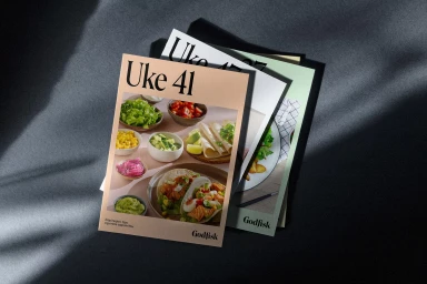
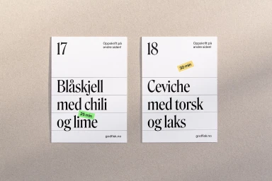
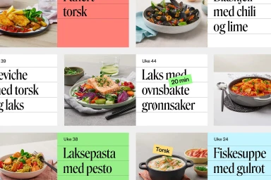
The Norwegian Seafood Council brand identity project establishes a visual system built on clean typography and vibrant culinary photography. Developed by TRY Design, with wordmark development by The Pyte Foundry and photography by Aina C Hole, the identity centers on the 'Godfisk' wordmark and the Roslindale Variable typeface. The project spans physical and digital assets, from promotional posters and recipe brochures to social media templates and website interfaces. The execution leans into a minimalist aesthetic, utilizing natural light and high-contrast color palettes to elevate food-focused imagery across commercial applications.
Style
Horizontal, Commercial, Clean
Techniques
Typography
Industries
Color
Pure White
Associated creatives


5000+ creatives to discover
Sign up to gain access to the entire directory. It’s free.
Visie is a curated library of creative professionals.