
New Chapter: Brand Identity


Jan 2019
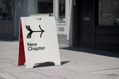
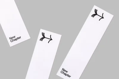
The brand identity overhaul for New Chapter serves as a masterclass in modern corporate minimalism, stripping away extraneous noise to focus on a singular, high-impact visual language. Spearheaded by the design expertise of Paul Belford Ltd, the project centers on a sophisticated graphic mark composed of four parallel curved lines that converge into a precise, forward-pointing arrow. This recurring motif captures a sense of dynamic movement while maintaining the rigid, clean structure demanded by contemporary commercial applications. By leveraging a high-contrast black-on-white palette, the team ensures the identity remains versatile, feeling equally at home on tactile stationery as it does on urban signage. The execution leans heavily into the power of negative space, a technique showcased through the careful art direction of the studio photography. Whether positioned on a stark A-frame pavement sign bathed in natural light or embossed on a slim bookmark within an open book, the identity maintains a distinct, methodical consistency. Through the use of crisp vector design and considered typography, New Chapter establishes an aesthetic that feels both professional and intellectually sharp. This project effectively demonstrates how a restrained approach to branding can elevate a corporate presence, using intentional, balanced compositions to create a lasting visual signature that remains both approachable and distinctly modern in its execution.
Horizontal, Commercial, Clean, Minimalist
Typography
Advertising Campaign
