
City Gateway: Brand Identity
Jun 2018
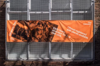
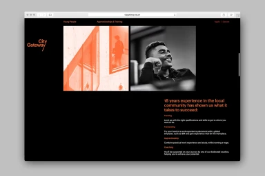
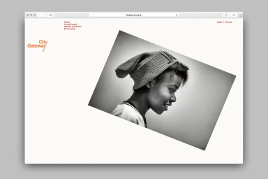
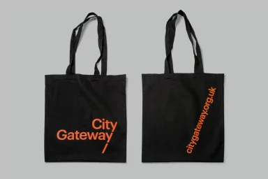
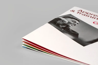
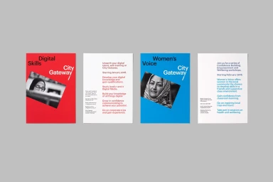
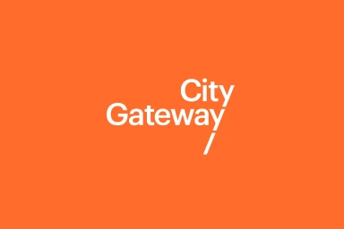
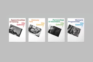
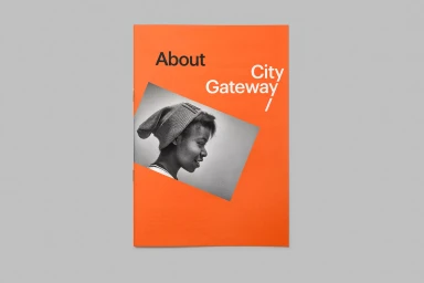
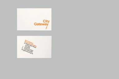
The brand identity for City Gateway, masterfully executed by Paul Belford Ltd, serves as a masterclass in how modular design principles can elevate a corporate mission. By balancing a stark, minimalist foundation with a bold, vibrant orange signature color, the project creates a visual language that feels both authoritative and accessible. The identity relies on a high-contrast aesthetic, utilizing clean sans-serif typography and purposeful color-coding to organize complex service offerings, ranging from vocational training to specific youth and community initiatives. A recurring design motif—the tilted black-and-white portrait integrated against white or color-blocked backgrounds—brings a human-centric warmth to the professional collateral. This is further supported by the strategic use of UI illustration techniques and precise print finishing on materials like brochures, tote bags, and signage. The project effectively employs bold typography to establish hierarchy, ensuring that essential information remains legible while maintaining a modern, editorial flair. Whether applied to an outdoor vinyl banner or a digital web interface, the design maintains total cohesion. By leveraging a consistent visual system of diagonal graphic accents and thoughtful negative space, the identity succeeds in communicating City Gateway’s professional, community-focused ethos without relying on unnecessary ornamentation. It is a striking example of how rigorous graphic design standards can unify diverse organizational touchpoints into a singular, memorable brand experience.
Horizontal, Commercial, Clean
Typography
Advertising Campaign
