
The Soap Co.
Brand Identity
Oct 2015
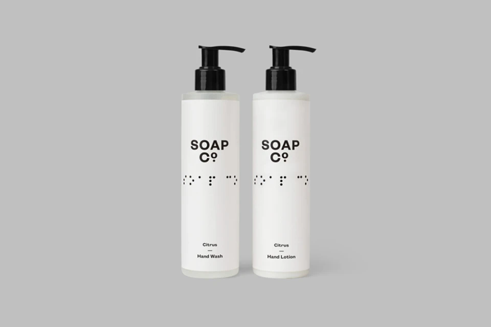
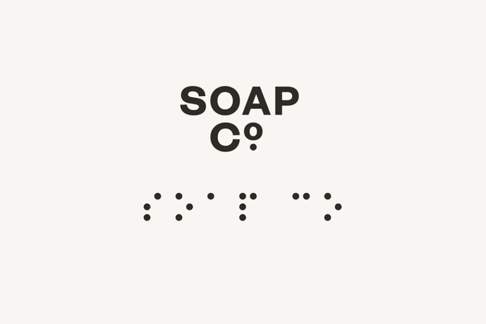
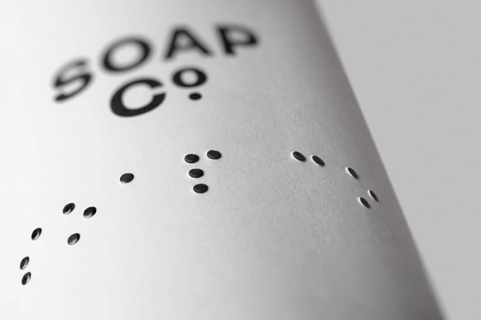
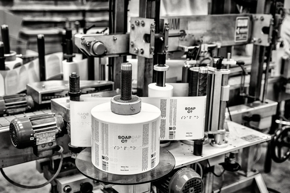
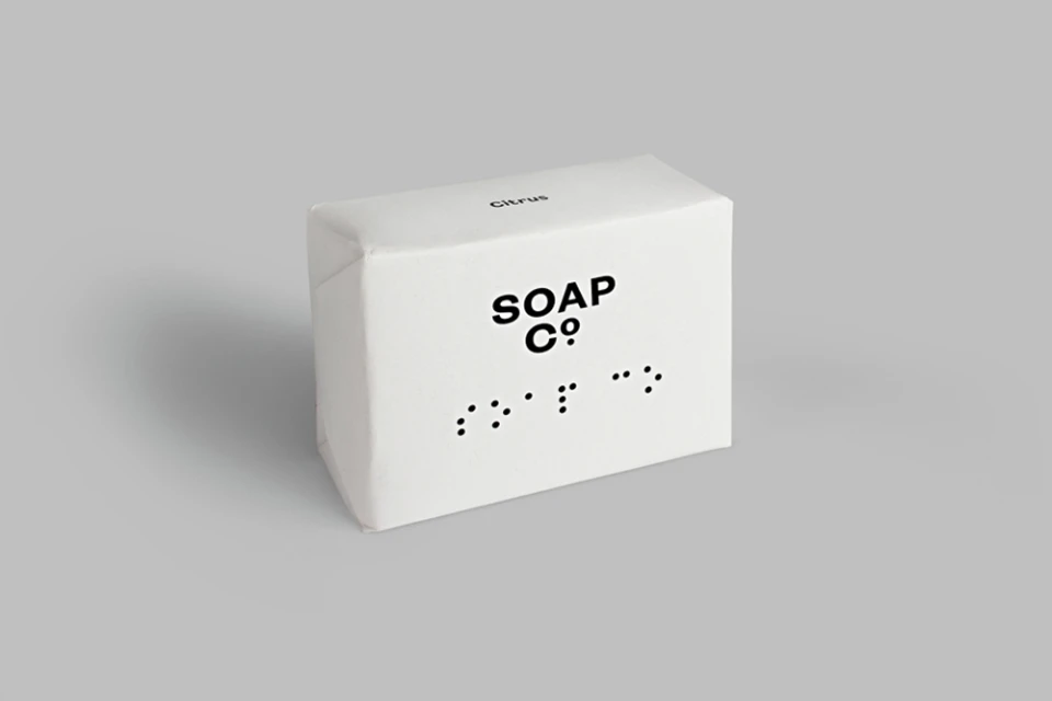
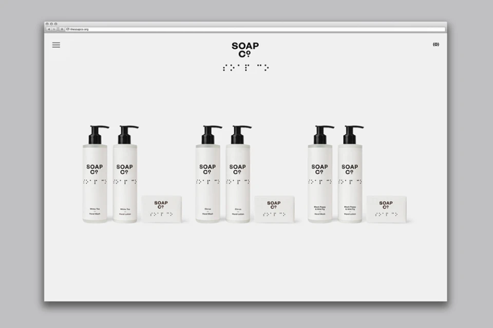
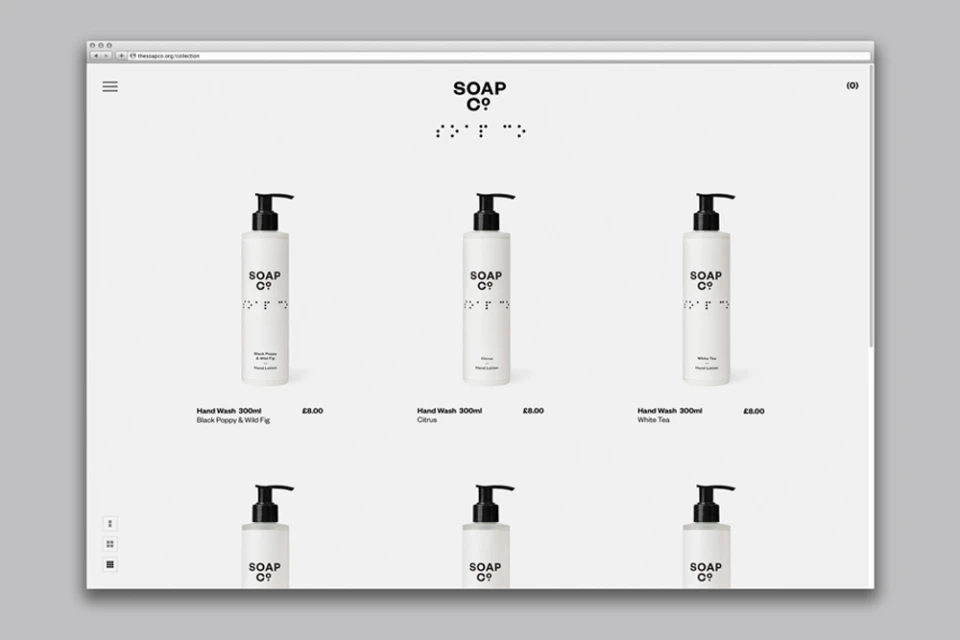
The Soap Co. brand identity project represents a masterclass in functional minimalism within the competitive CPG and packaged goods sector. Developed with precise graphic design by Paul Belford Ltd, the project strips away visual noise to prioritize accessibility and clarity, placing inclusive design at the heart of the consumer experience. The identity utilizes a stark, high-contrast palette of matte black on crisp white, anchored by bold, sans-serif typography that communicates directly and efficiently. Perhaps the most compelling feature is the integration of raised, embossed braille dots directly into the product packaging, transforming essential tactile information into a signature design element that balances industrial utility with sophisticated aesthetic restraint. The visual language, captured through meticulous studio strobe lighting and precise macro photography, emphasizes the clean, cylindrical silhouettes of the product line. This identity extends seamlessly from physical packaging—ranging from paper-wrapped bars to ergonomic bottle dispensers—into the digital realm with a clean, grid-based e-commerce interface that echoes the physical goods. By documenting the mechanical, industrial reality of the labeling process through cinematic, live-action techniques, the project provides a comprehensive look at how modern branding can marry high-concept design with inclusive, human-centric manufacturing. It is a cohesive, forward-thinking visual system that proves how essential accessibility can become a brand’s most powerful and distinguishing creative asset in a crowded retail landscape.
Horizontal, Commercial, Clean, Minimalist
White Seamless
