
Mosh: Brand Identity

Oct 2020
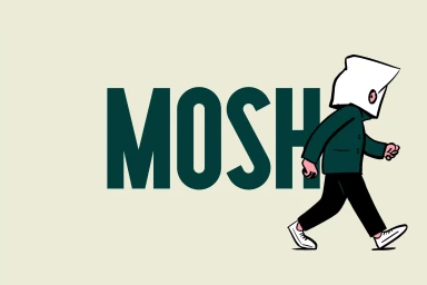
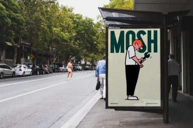
Mosh introduces a refreshed brand identity that centres on a minimalist graphic style, blending bold typography with whimsical illustrative vignettes. The project spans digital animation and outdoor advertising, establishing a cohesive visual system across various urban touchpoints. The identity, crafted by Universal Favourite with illustration by Mark Long, employs a vibrant green and cream palette alongside clean vector-style lines. The artwork features playful characters and graphic icons that maintain a consistent, uncluttered aesthetic across both static posters and motion assets. Execution focuses on bold serif typography and clear, simple iconography. The campaign assets are positioned in high-visibility transit environments, integrating the illustrative branding with commercial communication.
Horizontal, Clean, Artistic
Typography
Solid Colour

