LBDO: Brand Identity



Nov 2021
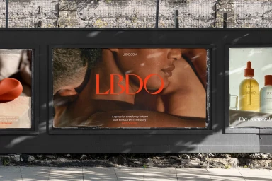
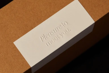
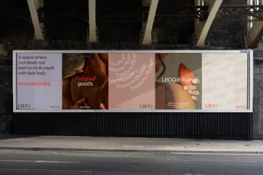
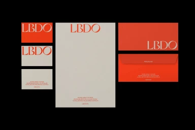
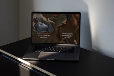
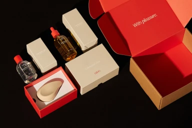
The brand identity for LBDO establishes a refined, tactile aesthetic across print, digital, and out-of-home platforms. The visual system leans into a palette of vibrant red and neutral off-white, paired with elegant serif typography to communicate a minimalist approach to wellness branding. By focusing on raw textures and intimate human connection, the project explores the interplay between physical product interaction and clean, architectural graphic layout. Universal Favourite spearheaded the graphic design, supported by copywriting from Cat Wall and motion design by Cameron Fernandes. Photographer Lauren Bamford and stylist Natalie Turnbull collaborated to capture the campaign's product photography and stationery suites, utilizing natural light and tactile set design to ground the brand's identity in a tangible, editorial space.
Horizontal, Commercial, Clean
Natural light