
Brand
ProjectBrand Identity
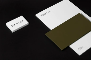
Kate Lee Brand Identity 2017
Associated creatives

Tags
Description
This graphic design showcase presents a clean brand identity for Kate Lee set against a dark background. The arrangement includes stacked white business cards on the left and a larger letterhead sheet on the right, featuring simple, elegant typography. An overlapping dark olive green envelope or card block adds a contrasting geometric element to the composition. The lighting is crisp and even, highlighting the smooth paper textures and minimalist aesthetic.