
BrandKate Lee
ProjectBrand Identity
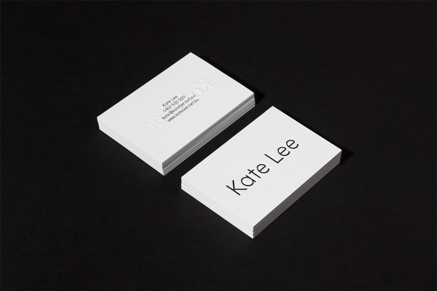
Kate Lee Brand Identity 2017
Associated creatives

Tags
Description
This graphic design project showcases a clean corporate identity for Kate Lee featuring minimalist business cards. Two stacks of crisp white cards rest on a dark, contrasting matte surface. The top card in the foreground displays bold, clean typography with the name Kate Lee in a modern sans-serif typeface. The adjacent stack shows a subtle blind debossed logo impression alongside legible contact details including phone number, email address, and website URL. The composition employs hard lighting to create sharp, defined shadows that emphasize the clean edges and texture of the paper stock.
Style
Horizontal, Commercial, Clean, Minimalist
Techniques
Typography, Emboss & Deboss
Color
Pure White (50%)
Jet Black (50%)
Background
Black Seamless
Context
Brand Film / Corporate Video