Logo
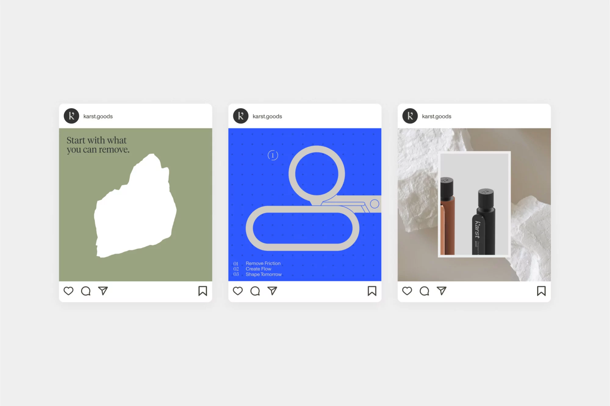
Three digital social media mockup tiles featuring brand identity designs for Karst against a neutral light grey background.
Graphic brand identity poster featuring bold black geometric shapes and typography against a vibrant blue background.
Bold yellow brand identity poster for Karst featuring dark serif typography with the headline Start with what you can remove
Modern metallic shelving unit displaying notebooks and raw stones on a neutral grey background.
Laptop computer displaying website branding with the text remove friction on a dark cabinet against a white wall.
Bold blue book cover design featuring black typography stating remove friction create flow against a black background
Orange graphic design poster with large black typography reading Making Space and Shape Tomorrow for Karst brand identity.
Two branded packaging boxes resting on a concrete ledge against a neutral grey studio background.
A set of pastel notebooks held by metal bookends on a sleek metallic shelving unit alongside textured stone pieces.
Two stacks of notebooks resting at an angle in a light purple pleated stand against a grey studio background
Minimalist line illustration of tiered desktop trays on a solid periwinkle background with typographic text.
Four advertising posters mounted on metallic architectural pillars showcasing brand identity design for Karst.
White brand logo for Karst centered against curving sculptural paper waves in neutral tones
Three digital social media mockup tiles featuring brand identity designs for Karst against a neutral light grey background.
Graphic brand identity poster featuring bold black geometric shapes and typography against a vibrant blue background.
Bold yellow brand identity poster for Karst featuring dark serif typography with the headline Start with what you can remove

Karst Brand Identity 2023

About

This brand identity project for Karst establishes a refined, minimalist design language that balances industrial precision with organic texture. The visual system, developed through a collaboration between Love + Money and someform, hinges on a structured interplay between bold, serif typography and clean geometric forms. Key motifs include a recurring comma-like graphic element and a systematic approach to color, ranging from vibrant cobalt and canary yellow to nuanced earth tones like slate, graphite, and bone. Execution blends graphic design with sophisticated 3D rendering to showcase the brand across digital and physical touchpoints. Technical highlights include macro CGI sequences of carved stone, animated UI interfaces for product customization, and minimalist packaging design. The project utilizes a restrained aesthetic and consistent lighting to emphasize tactile surfaces, creating a cohesive, high-contrast look that bridges contemporary motion graphics with professional print identity.

Brand

Credits

Styles

Techniques

5000+ profiles to discover

Sign up to gain access to the entire directory. It’s free.

Visie is a curated library of creative professionals.
Trusted by