
Islington Design District: Brand Identity

Date
Sep 2022
Description
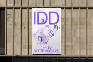
The Islington Design District brand identity project functions as a dynamic visual system for the festival, anchoring the event’s presence across digital and physical touchpoints. Designed by Campbell Hay, the visual language centres on a distinct palette of deep purple and metallic tones, unified by bold, clean typography. Moving from screen to street, the identity utilizes motion graphics to bring abstract 3D forms and geometric wireframe illustrations to life. The execution spans digital advertising displays, subway installations, and public square signage, maintaining a minimalist aesthetic that bridges the gap between festival branding and urban architectural context.
Style
Horizontal, Commercial, Clean
Techniques
Motion Graphics
Industries
Color
Violet
Associated creatives

5000+ creatives to discover
Sign up to gain access to the entire directory. It’s free.
Visie is a curated library of creative professionals.