
Islington Design District: Brand Identity
Date
Sep 2021
Description
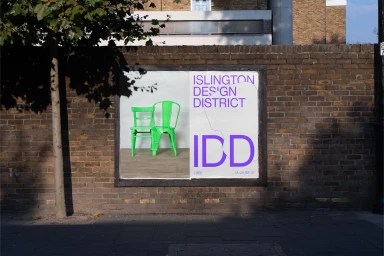
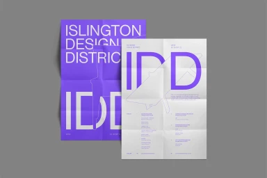
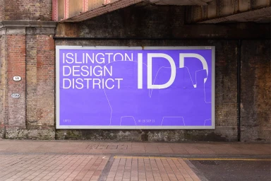
Campbell Hay delivers a comprehensive brand identity for the Islington Design District, establishing a visual language anchored in bold typography and a distinct purple and white color palette. The project spans across both static and digital touchpoints, including outdoor signage, posters, and motion graphic assets. Utilizing clean geometric lines and minimal layouts, the design system adapts across varying formats, from physical screen-printed posters to high-definition digital displays in urban transit environments. The identity leans into a minimalist aesthetic, ensuring the IDD acronym functions as a consistent, recognizable marker within the architectural landscape.
Style
Horizontal, Commercial, Clean
Techniques
Typography
Color
Violet
Pure White
Associated creatives

5000+ creatives to discover
Sign up to gain access to the entire directory. It’s free.
Visie is a curated library of creative professionals.