
Batera: Brand Identity
Jul 2020
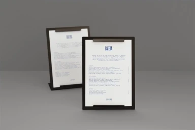
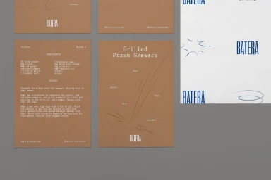
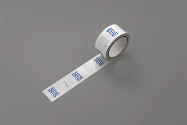
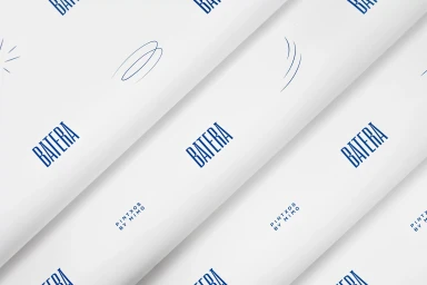
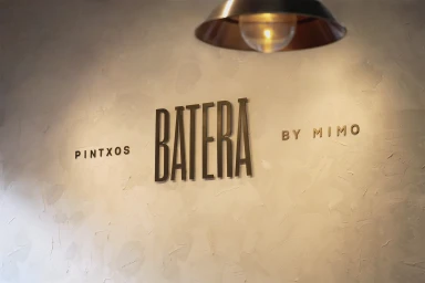
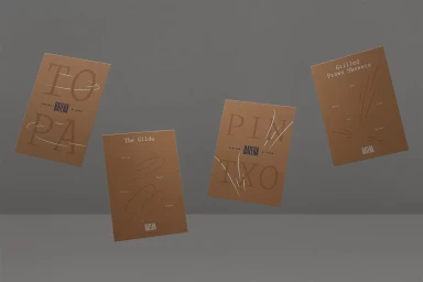
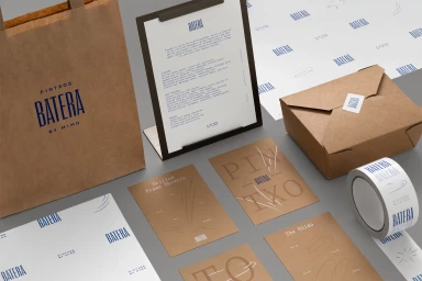
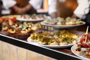
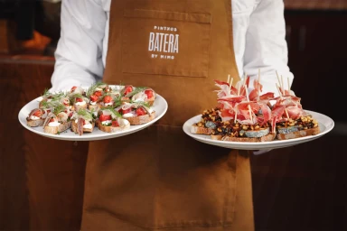
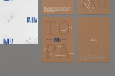
For the launch of Batera, a restaurant concept centered on the refined traditions of Basque cuisine, the brand identity project masterfully balances structural rigor with artisanal warmth. Through a sophisticated visual language, the project elevates the humble pintxo into a high-end culinary experience. Graphic design firm Campbell Hay leads the aesthetic direction, employing a deliberate palette of deep blues and organic, earthy brown paper textures to ground the brand. The identity relies on a restrained, slim sans-serif typeface that leans into editorial minimalism, creating a cohesive system that spans everything from industrial metallic signage to branded packaging tape. Captured through the lens of photographer Wai Ming Ng, the campaign utilizes soft light and natural textures to bridge the gap between static corporate materials and the dynamic, lived-in reality of the restaurant floor. The integration of UI illustration—featuring hand-drawn starburst motifs and linear icons—infuses the rigid grid layouts with a touch of approachable charm. By pairing crisp, professional typography with tactile elements like textured plaster walls and canvas aprons, the work successfully communicates a brand that is both contemporary and deeply rooted in heritage. The resulting visual system is a masterclass in modern hospitality branding, proving that a clear, consistent design language is essential for translating complex culinary stories into a compelling commercial reality.
Horizontal, Commercial, Clean, Minimalist
Advertising Campaign

