
Hug: Brand Identity
Feb 2019
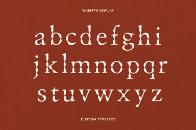
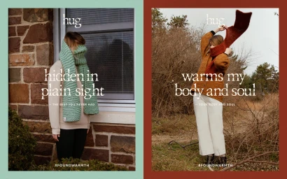
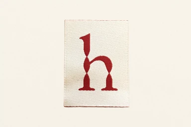
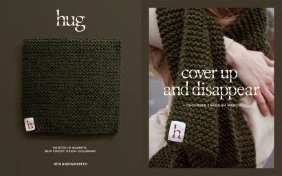
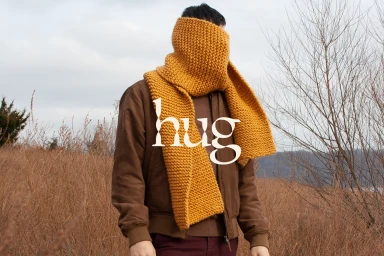
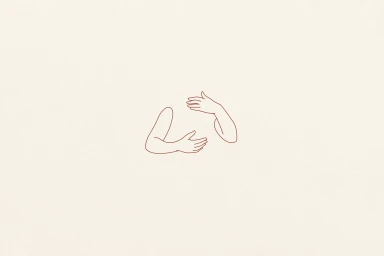
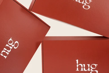
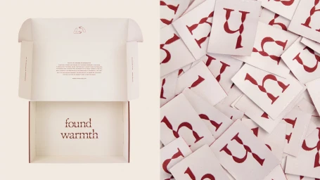
The brand identity for Hug represents a masterclass in editorial minimalism, seamlessly blending high-end fashion sensibilities with a deeply tactile, human-centric design language. Led by the graphic design expertise of Adam Lowe, the project establishes a cohesive visual vocabulary that leans heavily into artisanal quality and comfort. The core identity is anchored by the Warmth Display, a custom serif typeface defined by pinched, fluid strokes that suggest movement and organic warmth. This typographic foundation is expertly extended across a curated color palette of terracotta, deep forest green, and cream, effectively reinforcing the brand's position within the luxury fashion houses sector. The execution employs varied techniques, from the intricate embroidery of the woven textile labels to a series of high-contrast fashion photography shots that utilize soft, natural light to emphasize the chunky wool textures of the knitwear collection. By integrating a continuous-line illustration of an embrace, the design successfully bridges the gap between commercial efficiency and emotional resonance. The project packaging, featuring matte finishes and clean geometric layouts, completes the brand story, ensuring that every touchpoint from e-commerce shipping boxes to woven labels feels intentional. Through the strategic use of vector-based art and minimalist composition, the identity creates an atmosphere of sophisticated serenity that remains approachable, perfectly capturing the season of warmth and connection that the brand aims to convey.
Horizontal, Commercial, Minimalist, Clean
Typography
