
Thomas Haas Blak: Brand Identity

Jan 2020
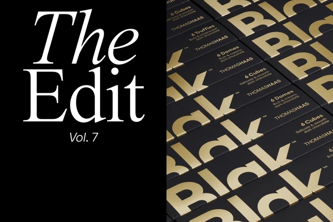
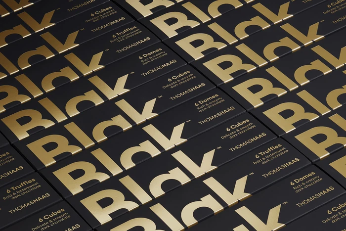
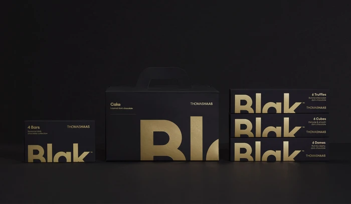
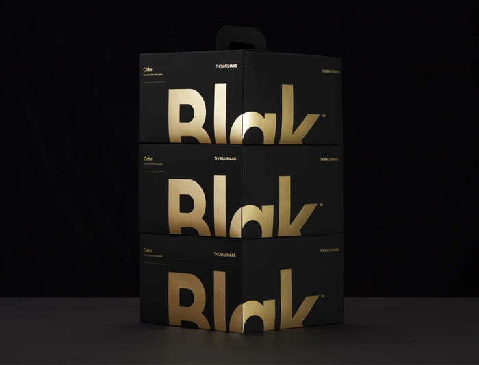
The brand identity for Thomas Haas Blak chocolate stands as a masterclass in minimalist luxury, effectively elevating the culinary experience through refined packaging design. By anchoring the visual language in a stark, high-contrast palette of matte black and metallic gold, the project achieves a sophisticated aesthetic that feels both architectural and modern. The execution relies heavily on the interplay between tactile textures and precise typography, utilizing techniques like emboss and deboss to provide a premium, sensory dimension to the product packaging. Throughout the collection, soft light is employed to emphasize the reflective sheen of the gold foil against dark, seamless backgrounds, creating a balanced and professional composition that signals high-end craftsmanship. The design transcends simple branding by organizing product varieties with clean, sans-serif white text, ensuring that every element—from the cake boxes to the chocolate cubes—feels part of a cohesive and intentional system. This project, directed through the collaborative efforts of Pendo, Vencho Miloshevski, Neue, Leif Podhajský, and Adam Lowe, illustrates how corporate design can lean into editorial minimalism to capture consumer attention. By prioritizing structural symmetry and graphic clarity, the identity for Thomas Haas Blak effectively positions the brand within the luxury food market, proving that when typography and material choice are executed with such exacting standards, the packaging itself becomes the most powerful marketing asset.
Horizontal, Commercial, Clean
E-commerce / Product


