Empirical: Brand Identity

Jul 2020
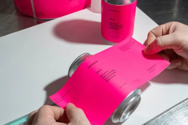
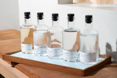
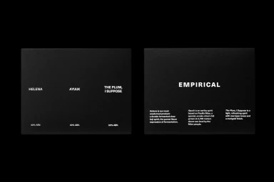
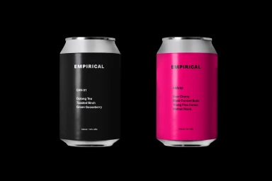
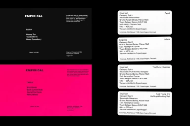
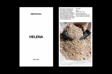
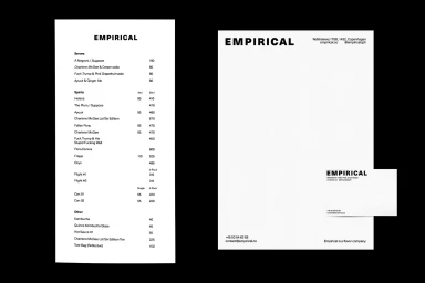
In the evolving landscape of the alcoholic beverages and food and beverage sectors, the brand identity project for Empirical stands as a masterclass in editorial minimalism. This comprehensive visual program bridges the gap between raw, tactile production and polished corporate communication. By leveraging a Swiss-inspired design language, the branding emphasizes clarity and high-contrast typography, effectively allowing the complex ingredients—ranging from oolong tea and green gooseberry to sour cherry and walnut wood—to serve as the primary narrative. The execution reflects a deliberate tension between the clinical, process-oriented imagery captured by photographer Sam Youkilis and the precise, graphic design work of Matthew Tremaine. Through a series of commercial assets, the project utilizes soft light and natural light to elevate utilitarian elements, such as manual labeling processes and technical ingredient lists, into a cohesive aesthetic system. The identity leans into a raw, occasionally rebellious graphic style, shifting seamlessly from high-end, clean product photography to gritty, collage-based artistic expressions. This versatility ensures that Empirical maintains a sophisticated, orderly presence across both printed stationery and digital interfaces, while never sacrificing the distinct, industrial edge that defines their craft spirits. By prioritizing clean sans-serif typefaces against stark monochromatic backgrounds, the design identity successfully frames Empirical as a brand defined by both its transparent methodology and its unapologetically modern, design-forward ethos.
Horizontal, Commercial, Clean, Minimalist
Typography