
Christopher Doyle & Co.: Brand Identity
Date
Jul 2023
Description
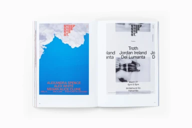
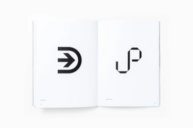
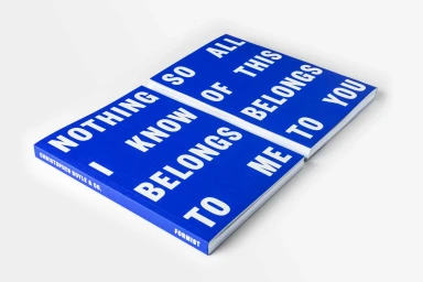
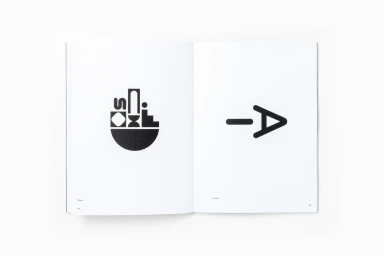
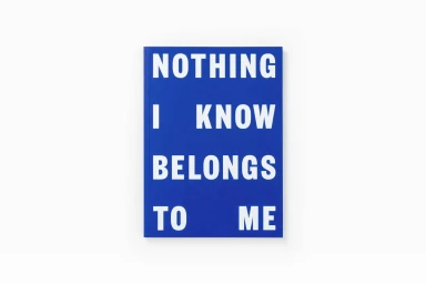
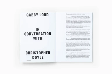
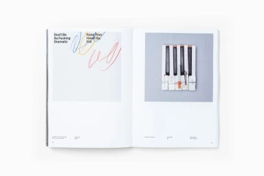
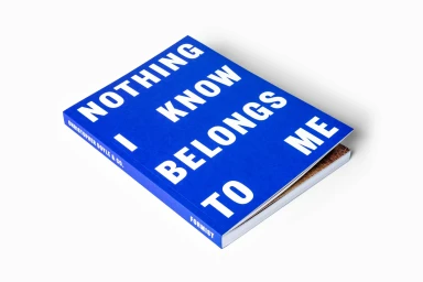
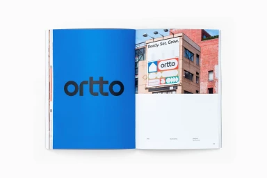
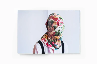
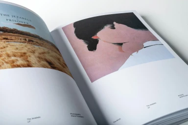
Christopher Doyle & Co. delivers a precise visual language for this comprehensive brand identity project. The work centers on editorial and commercial applications, leveraging clean modernist typography and stark grid structures to organize visual information across various publications. The project utilizes a minimalist aesthetic, often pairing deep saturated blue fields with high-contrast white lettering and graphic symbols. Featuring collaborative publishing with Formist, the identity system balances rigid geometric glyphs and sans-serif type with unexpected photographic elements and screen-printed textures.
Style
Editorial, Horizontal, Clean, Minimalist
Techniques
Typography
Color
Pure White
Background
White Seamless
Context
Editorial
Associated creatives


5000+ creatives to discover
Sign up to gain access to the entire directory. It’s free.
Visie is a curated library of creative professionals.