
unknown: Brand Identity
Aug 2019
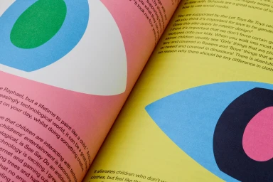
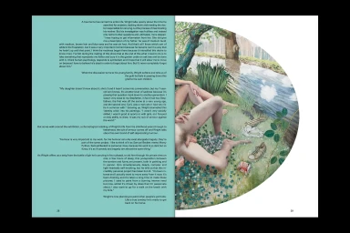
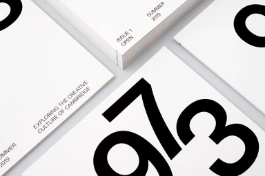
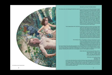
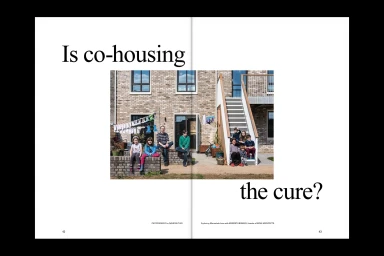
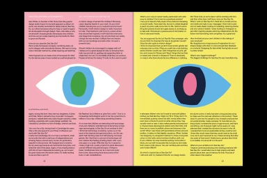
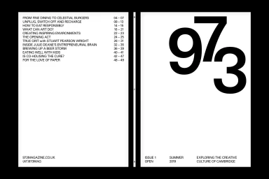
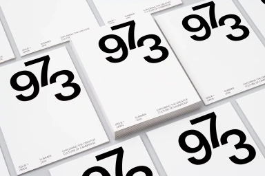
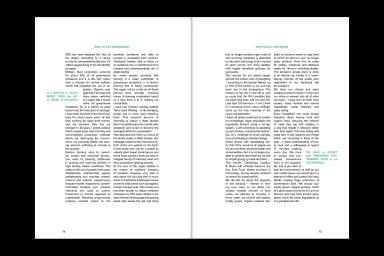
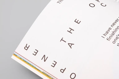
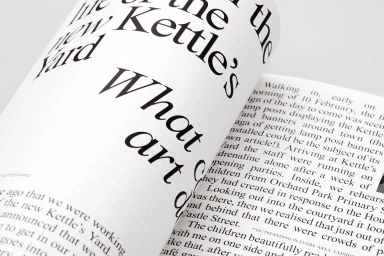
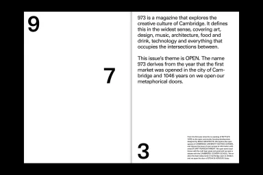
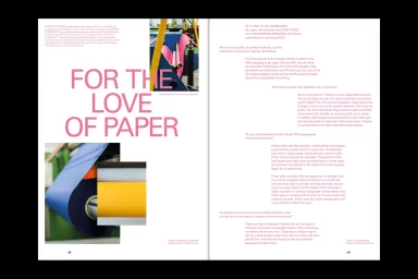
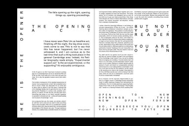
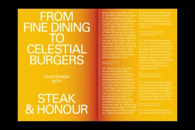
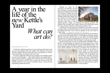
This sophisticated brand identity project for 973 Magazine serves as a definitive case study in modern editorial design, balancing rigorous structure with playful artistic expression. Across various spreads, the work employs a minimalist visual language that relies on high-contrast color blocking and precise grid systems to establish a strong, professional hierarchy. By utilizing bold, sans-serif typography as a primary graphic element, the design achieves a sense of clarity that elevates the publication's exploration of Cambridge's creative culture. The project is distinguished by its seamless integration of diverse media, ranging from macro photography of tactile paper stocks to intricate oil painting illustrations and live-action lifestyle imagery. The creative team at The District demonstrates a masterful command of white space, allowing vibrant color palettes—such as the interplay of primary blues, pinks, and yellows—to anchor the reader’s eye without overwhelming the page. Whether navigating complex infographics or dense editorial text on sustainable food practices, the design maintains a consistent aesthetic that feels both commercial and deeply artistic. This work successfully bridges the gap between traditional print heritage and contemporary, digital-ready typography, creating a cohesive, tactile experience that celebrates the enduring power of print in the modern media landscape through careful attention to detail and structural balance.
Editorial, Horizontal, Clean
Typography
Editorial
