
Brand
ProjectBrand Identity
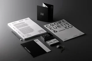
Cooke Curtis & Co Brand Identity 2017
Associated creatives

Tags
Description
This brand identity presentation for Cooke Curtis and Co, designed by The District, showcases a cohesive set of corporate stationery items arranged on a dark grey surface. The arrangement includes letterhead paper, folded brochures, stacks of business cards, a black folder with metallic clips, a pencil, and a set of keys. The typography is modern and minimalist, utilizing bold sans-serif lettering across all collateral pieces. The lighting is soft and directional, creating subtle shadows that give the flat objects a tactile, dimensional presence. The monochrome palette of black, white, and grey reinforces the clean, professional design aesthetic.