
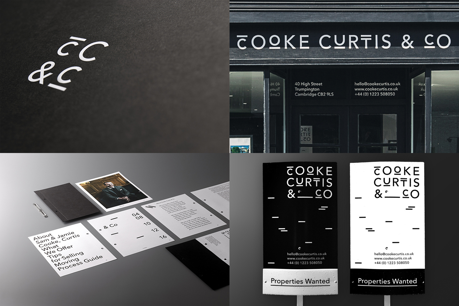
Cooke Curtis & Co Brand Identity 2017
Associated creatives

Tags
Description
This four-panel composite showcases the comprehensive brand identity design created by The District for Cooke Curtis and Co. The top left quadrant features the distinctive minimalist logo rendered in white against a dark textured surface. The top right panel displays the physical storefront with clean dark framing and bold white typography spelling out the company name alongside contact details. The bottom left quadrant lays out corporate stationery, including brochures and a framed portrait photograph arranged on a flat surface. Finally, the bottom right quadrant presents dual vertical exterior signage boards in contrasting black and white colorways featuring the stylized typographic mark and property marketing messages.
Style
Horizontal, Commercial, Clean, Graphic
Techniques
Typography, 3D render / CGI
Industries
Real Estate Platforms
Color
Context
Advertising Campaign