
Contrast Foundry: Brand Identity
Brand
Date
May 2025
Description
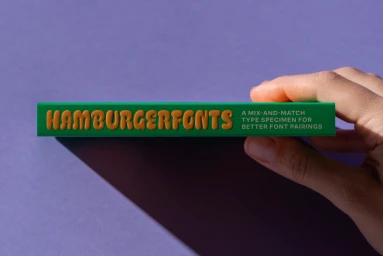
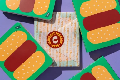
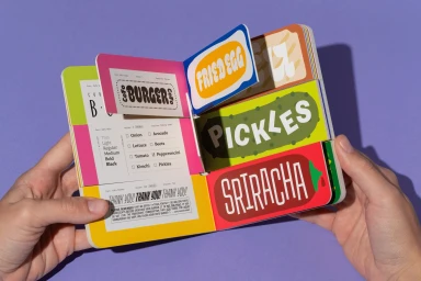
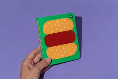
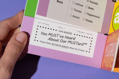
Contrast Foundry showcases its latest brand identity project, a vibrant type specimen system designed to highlight font pairings through tactile, food-inspired collateral. The identity features a bold color palette of purple, green, and yellow, utilizing graphic illustration and die-cut elements to present typefaces in a playful, interactive format. The project incorporates clean studio lighting and crisp geometric layouts to emphasize the matte paper textures and printed finishes. Graphic design and illustration by The Office of Ordinary Things accompany the type design by Contrast Foundry, spanning both static specimen books and animated brand assets that lean into a retro aesthetic.
Style
Horizontal, Commercial, Clean
Industries
Color
Forest Green
Crimson
Background
Solid Colour


5000+ creatives to discover
Sign up to gain access to the entire directory. It’s free.
Visie is a curated library of creative professionals.