Christopher Doyle & Co. Brand Identity 2023
About
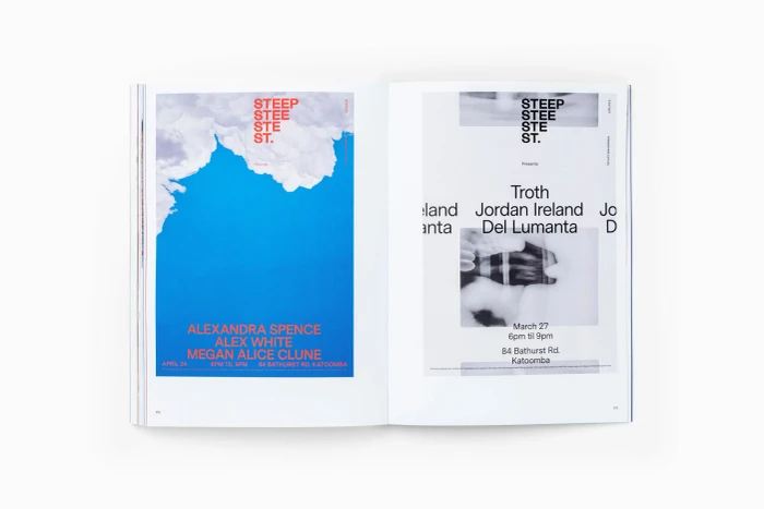
An open book displays two distinct black graphic identity marks centered on opposite crisp white pages. The left page features a bold geometric glyph with an embedded arrow, while the right page shows a ribbon-like linear monogram symbol. The publication is part of the Brand Identity project created by Christopher Doyle and Co with publishing by Formist. The clean layout emphasizes negative space and stark monochromatic contrast.
Brand
Project
Keywords
Credits
Styles
Techniques
Background
White Seamless
Context
Editorial