
Formist: Brand Identity

Mar 2021
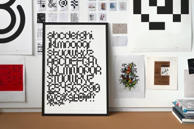
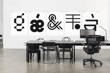
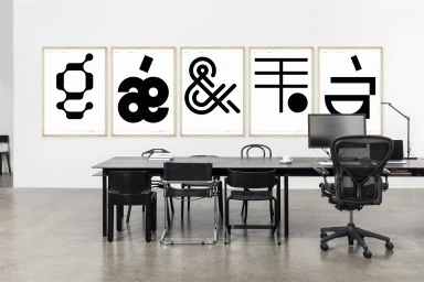
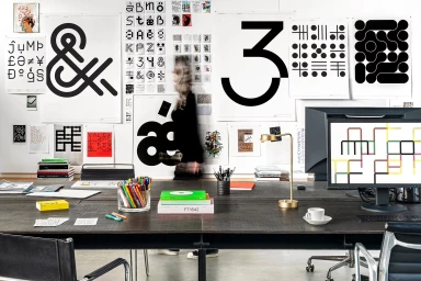
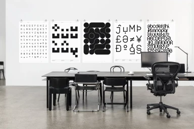
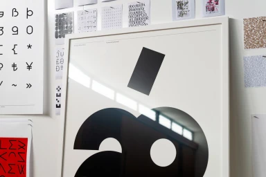
Formist presents a comprehensive brand identity project centered on experimental typography and structural graphic design. The execution leverages a stark monochrome palette, utilizing bold abstract symbols and geometric character sets to establish a distinct visual language within a professional workspace. The identity is presented through a series of large-scale framed prints and studio-based graphic design studies. The aesthetic prioritizes a minimalist approach, relying on sharp contrast and precise alignment to communicate the brand's core principles. Applications of the identity appear in a contemporary office setting, incorporating natural light to highlight the clean lines and paper textures of the typographic works.
Clean, Minimalist, Horizontal
Office
Advertising Campaign
