
Beams: Brand Identity
Aug 2023
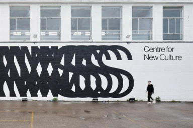
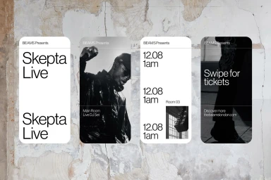
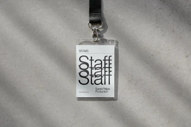
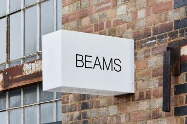
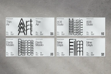
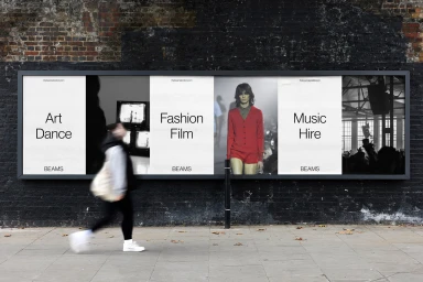
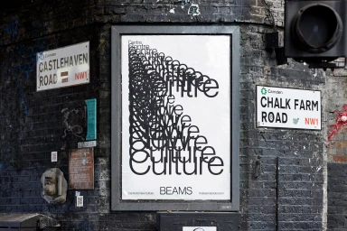
The brand identity for Beams establishes a bold, monochrome visual system defined by its stark typographic layouts and modular design framework. Developed with graphic design by Only, this project navigates the intersection of commercial aesthetic and industrial architecture, utilising a clean, minimalist approach to unify event programming, editorial assets, and physical signage. Photography by Henry Woide and Marcus Ginns captures the brand across diverse applications, ranging from digital interfaces to large-scale urban installations. The identity relies on precise grid alignment and high-contrast motion graphics to activate the venue’s cultural programming, while the web development by Combination ensures the digital tools mirror the physical design language. The result is a cohesive, scalable identity that leans into expansive negative space and repetitive typographic motifs.
Horizontal, Commercial, Clean


