
Printworks London
Brand Identity
Jan 2017
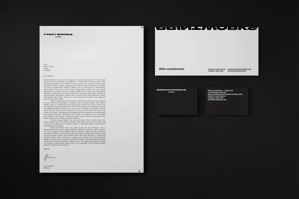
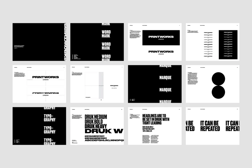
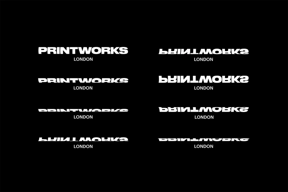
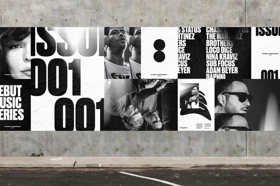
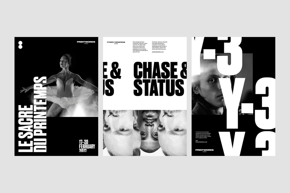
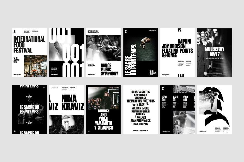
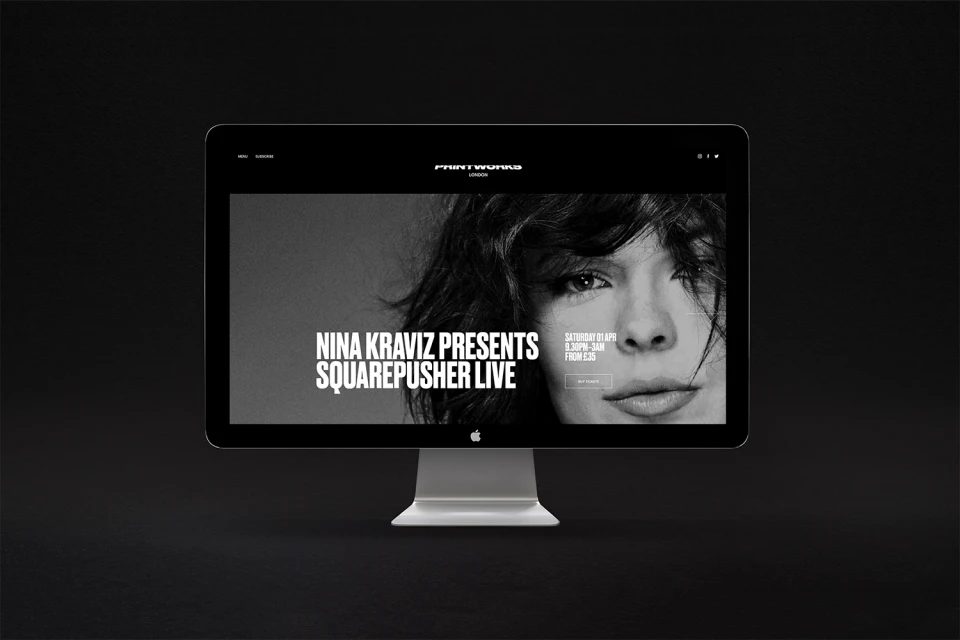
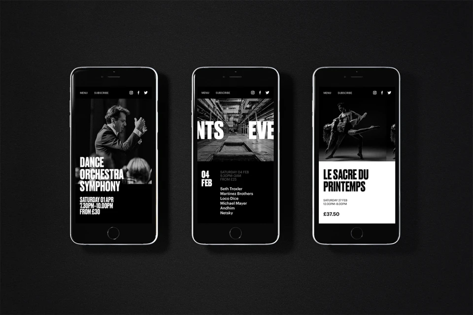
The brand identity for Printworks London serves as a masterclass in industrial-inspired, monochromatic design, effectively bridging the gap between a cavernous event space and a high-end cultural institution. By utilizing a strict black-and-white color palette and a bold, sans-serif typeface, the visual language establishes a sense of authority and geometric precision that resonates across both digital and physical touchpoints. The project, executed by the studio Only, leans heavily into editorial minimalism and industrial aesthetic cues, utilizing the Druk font family to create impactful, high-contrast layouts. The design system is defined by its modular flexibility; through deliberate logo manipulation, grid-based posters, and layered cinematic photography, the identity feels both raw and methodically structured. This synthesis of clean, corporate stationery and gritty, event-focused promotional assets demonstrates a sophisticated brand identity that can oscillate between a sleek corporate interface and the high-energy atmosphere of a music venue. Whether applied to mobile UI, event posters featuring concert performers, or formal letterheads, the system remains anchored by its consistent typography and clever use of negative space. Ultimately, this comprehensive identity system provides a clear visual hierarchy that mirrors the diverse programming of Printworks London, successfully marrying the venue’s industrial heritage with a contemporary, high-fashion sensibility that feels both timeless and urgent.
Horizontal, Commercial, Clean, Minimalist, Monochrome
Typography
Advertising Campaign
