
BrandBatch Organics
ProjectBrand Identity
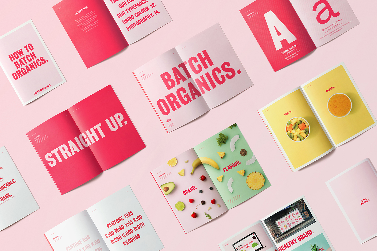
Batch Organics Brand Identity 2017
Associated creatives

Tags
Description
Flat lay photograph showcasing multiple open brand guideline booklets and pages arranged across a pale pink background. The spreads feature bold typography, color palettes with Pantone references, and vibrant food imagery including fruit and smoothie ingredients. Designed by Ragged Edge as part of the Brand Identity project for Batch Organics, the composition employs a clean, overhead perspective with bright studio lighting. The color palette spans prominent shades of pink, yellow, and green against a neutral surface.
Style
Horizontal, Commercial, Clean, Minimalist
Techniques
Typography
Industries
CPG / Packaged Food
Color
Hot Pink (50%)
Golden Yellow (30%)
Sage (20%)
Background
White Seamless
Context
Advertising Campaign, Editorial