
ACMI: Brand Identity




Oct 2020
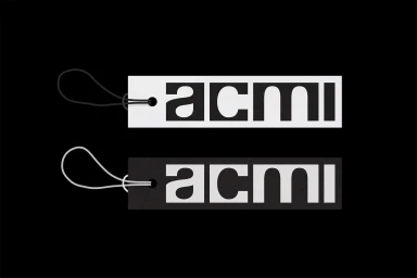
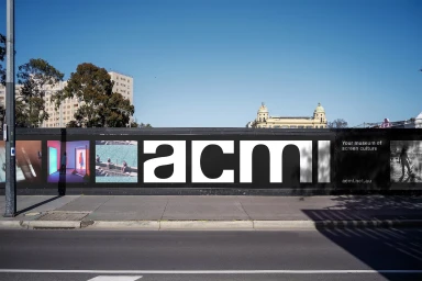
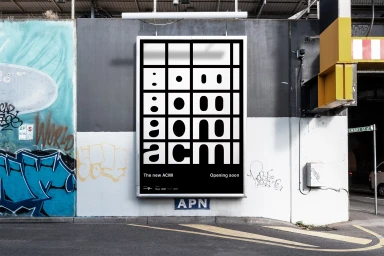
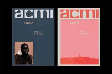
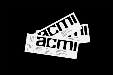
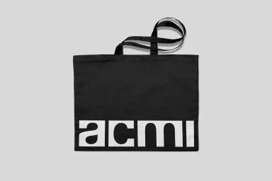
The brand identity for ACMI, developed by the design studio North, establishes a modular visual system for the media and entertainment institution. The project centres on bold sans-serif typography, using high-contrast monochrome and clean layouts to build a versatile design language. This identity spans both digital and physical applications, from kinetic motion graphics to tactile print collateral including tickets and tote bags. Applying a minimalist approach across urban streetscapes and editorial publications, the design incorporates a distinct typographic grid. The system integrates photographic stills and color blocking, ensuring consistency across signage, hoarding installations, and publication covers. By utilizing striking letterforms and adaptable framing structures, the identity communicates institutional presence through precision and scale.
Horizontal, Commercial, Clean, Minimalist
Typography
