Logo
St. Leo
1 projects·0 creatives·

Featured St. Leo projects

This week's top St. Leo projects, carefully handpicked by Visie's expert curators, showcase the best in style and innovation.
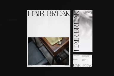
Graphic design layouts featuring bold serif typography reading Hair Break alongside interior imagery of a dark wooden salon station Project

St. Leo · Brand Identity

The brand identity for St. Leo is an masterclass in understated luxury, weaving together a sophisticated visual system that prioritizes tactile materiality and structural simplicity. Through a series of meticulously composed corporate collateral, the project leverages a muted, earthy palette of cream, beige, and olive green to ground its modern aesthetic. The execution relies heavily on the interplay of high-end design sensibilities and professional graphic design, utilizing techniques such as emboss and deboss to imbue stationery with a refined, premium quality. Whether presenting clean invoices and envelopes on stark white surfaces or high-contrast studio shots against natural stone, the work consistently leans into a minimalist and structured framework. Typography serves as the anchor, with elegant serif and bold sans-serif pairings creating a timeless visual language that feels both architectural and human-centric. By focusing on the interplay of negative space and rich textures, the identity system captures the essence of a brand rooted in professional refinement. Each element, from the subtle halftone gradients to the sharp, geometric angles of the business cards, contributes to a cohesive narrative of craftsmanship. This body of work, elevated by the collaboration of diverse creative voices including Alex Hunting Studio, Marion Bisserier, UNWIND, Tiffanie Mazellier, and Duane Dalton, creates a masterfully restrained brand presence that speaks to a modern, design-conscious audience.





