

HART
Featured HART projects
This week's top HART projects, carefully handpicked by Visie's expert curators, showcase the best in style and innovation.
HART · Takes You There
HART’s 'Takes You There' is a commercial video campaign focusing on the daily operations and passenger experience within public transit. The spot centers on the routine of city commuters and transit operators through intimate perspectives of the commute, from bus interiors to exterior street views. Produced by Max Cooper, the film utilizes cinematic lighting and live-action technique to capture the transit network. The clean aesthetic and natural color grading emphasize the mechanical and human elements of the travel and hospitality experience.
 Project
 HART · Brand Identity
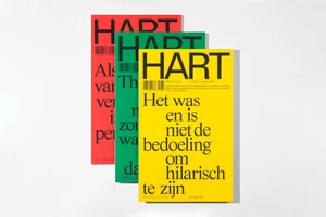
The brand identity project for HART magazine functions as a masterclass in editorial minimalism, demonstrating a sophisticated approach to publication design that prioritizes visual impact and structured clarity. Orchestrated by the creative minds at Vrints-Kolsteren, the project leans into a rigorous typographic framework that anchors dense, text-heavy Dutch layouts with bold, oversized serif and sans-serif headers. This design language is consistently applied across various editions, utilizing color blocking—vibrant reds, yellows, and greens—to transform standard magazine covers into striking graphic objects. By pairing high-contrast typography with varied visual assets, ranging from moody, cinematic landscape photography to gritty, analogue-style documentary portraits, the project establishes a cohesive yet dynamic identity. The execution skillfully balances the white space of the page with complex editorial content, occasionally integrating UI illustration elements and layered photographic insets to build depth. Each spread feels intentional, mirroring a gallery-like sensibility where archival imagery and modern lifestyle shots coexist within strict, clean margins. Through this meticulous arrangement, the design team creates a rhythmic reading experience that feels both contemporary and timeless. The result is a polished, professional brand identity that honors the architectural and artistic subject matter of the publication while maintaining a distinct, high-end commercial aesthetic that thrives on simplicity and careful, considered placement of every graphic element.
Explore other brands
Explore Visie’s leading industries, projects, and the talented creatives representing them.





