

CMYK
Featured CMYK projects
This week's top CMYK projects, carefully handpicked by Visie's expert curators, showcase the best in style and innovation.
 Project
 CMYK · Brand Identity
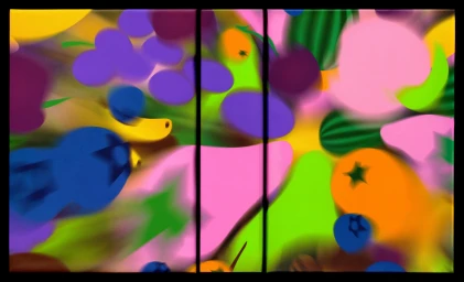
The brand identity for the Fruit Fight card game, developed by CMYK, is a masterclass in high-contrast commercial design, effectively blending playful, kinetic energy with a clean, modern aesthetic. Orchestrated by design firms SMLXL and Principi, the project establishes a distinct visual language characterized by saturated, bold primary colors—vibrant magentas, forest greens, and deep blues—that anchor the entire suite of assets. Through a mix of vector graphics and precise 3D render / CGI applications, the team creates a dynamic, pop-art inspired world that feels both tactile and digital. The branding leans into an abstract, airbrushed style for the fruit illustrations, ensuring that the packaging design stands out on any shelf while maintaining a cohesive, sophisticated look. From the rigid pink slipcase to the strategically scattered cards arranged in top-down, high-angle compositions, every element emphasizes the structural precision of the game. Studio strobe lighting and natural light configurations are expertly utilized to highlight the matte textures of the card stock and the sharp, sans-serif typography that defines the FRUIT FIGHT identity. By balancing stylized, motion-blurred fruit forms with disciplined graphic layouts, the creative team has successfully transformed a simple game concept into a cohesive, high-impact brand experience that feels both experimental and commercially refined.
 Project
 CMYK · Brand Identity
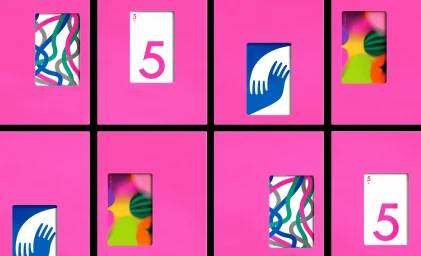
The brand identity for CMYK leverages a vibrant, geometric design system that anchors its commercial visual language. The project centres on a series of tactile product packages and custom cards, utilising a bold colour palette of saturated pinks, deep greens, and maroons paired with clean, minimalist typography. Developed by SMLXL and Principi, the graphic design utilises a grid-based framework that incorporates abstract illustrations and structural cut-outs to create rhythm. Structural design by Jonas Lagerstedt provides a precise, functional foundation for the packaging, while photography by Daniel Forero uses crisp, even studio lighting to highlight the matte paper textures and geometric clarity of the system.
Explore other brands
Explore Visie’s leading industries, projects, and the talented creatives representing them.





