CMYK: Brand Identity
Oct 2025
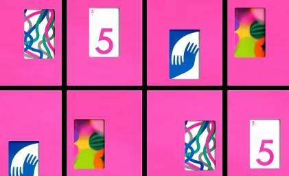
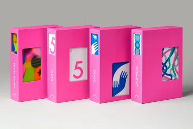
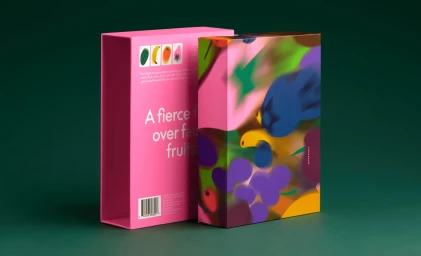
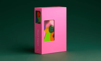
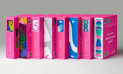
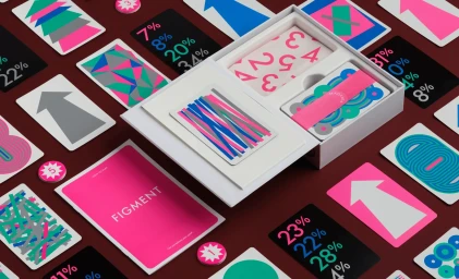
The brand identity for CMYK leverages a vibrant, geometric design system that anchors its commercial visual language. The project centres on a series of tactile product packages and custom cards, utilising a bold colour palette of saturated pinks, deep greens, and maroons paired with clean, minimalist typography. Developed by SMLXL and Principi, the graphic design utilises a grid-based framework that incorporates abstract illustrations and structural cut-outs to create rhythm. Structural design by Jonas Lagerstedt provides a precise, functional foundation for the packaging, while photography by Daniel Forero uses crisp, even studio lighting to highlight the matte paper textures and geometric clarity of the system.
Horizontal, Commercial, Minimalist, Clean
E-commerce / Product